Just a place for me to put stuff
Work stuff, life stuff, update stuff.
Lightmatter.com Redesign
Overview
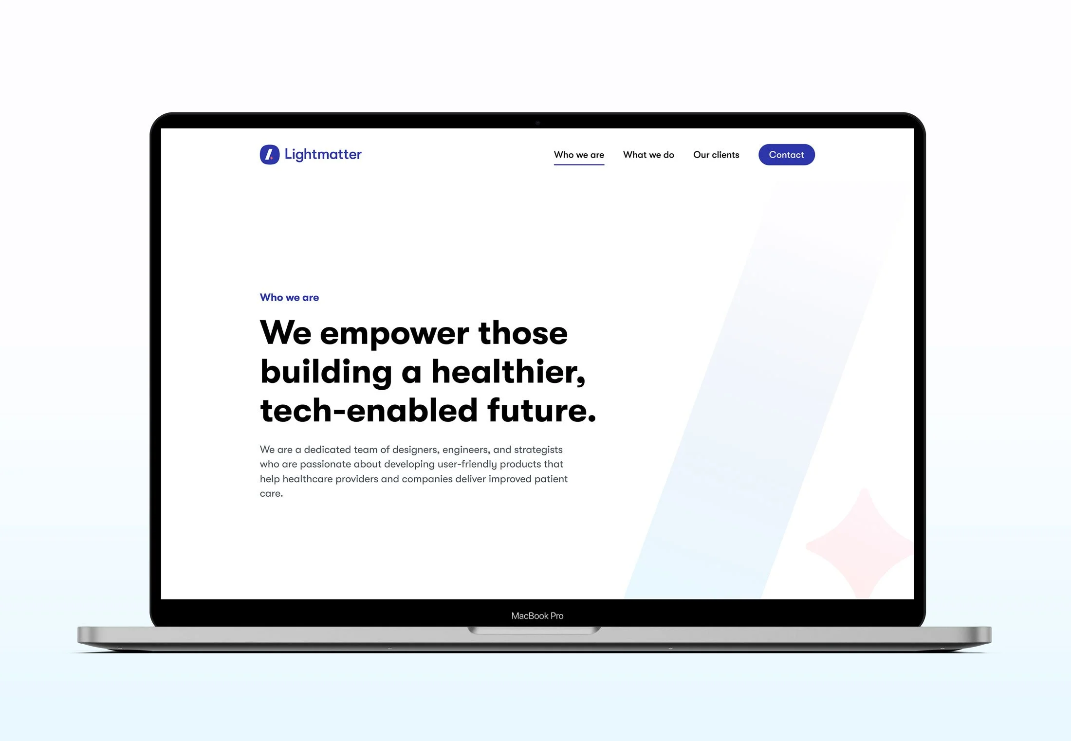
In between client work at Lightmatter, the design team would update internal UX/UI design systems or use the time to update presentations, create blog post illustrations, etc. After making the decision to work exclusively with healthcare and wellness clients, we were in need of completely redesigning our site. Up until this point, we were using a re-skinned version of our previous portfolio and it was no longer able to grow with us, so it was time to redesign!
You can visit the new site design here.
The Challenges
Lightmatter's brand is intentionally minimal, requiring a clean yet substantial design.
The need to showcase work without revealing proprietary designs led to a unique challenge.
The original website was built on Wagtail CMS. It was powerful but inflexible; we needed a more adaptable solution.
We needed straightforward, distinct site, avoiding flashy elements, confusing navigation, and the forever distasteful scroll-jacking.
From Wagtail to Webflow
We recognized the need to transition to a more adaptable platform. Our existing website was constructed using Wagtail, a CMS really only designed simple content updates, but proved challenging when it came to making visual adjustments. Our goal was to find a solution that not only made for easy updates but also eliminated the need for engineering resources during the development process. Webflow was the obvious choice, excelling in both areas.
Updates we made
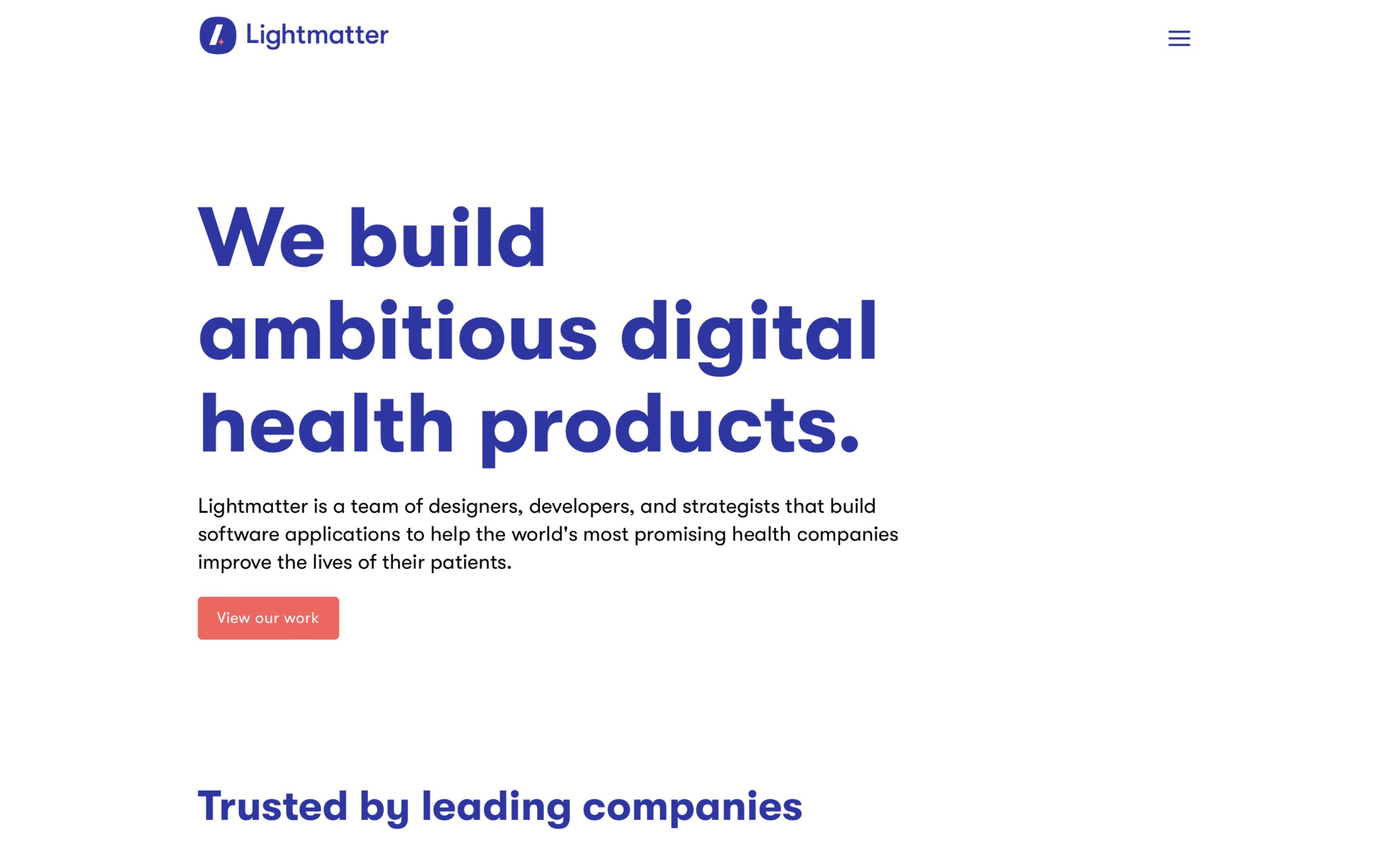
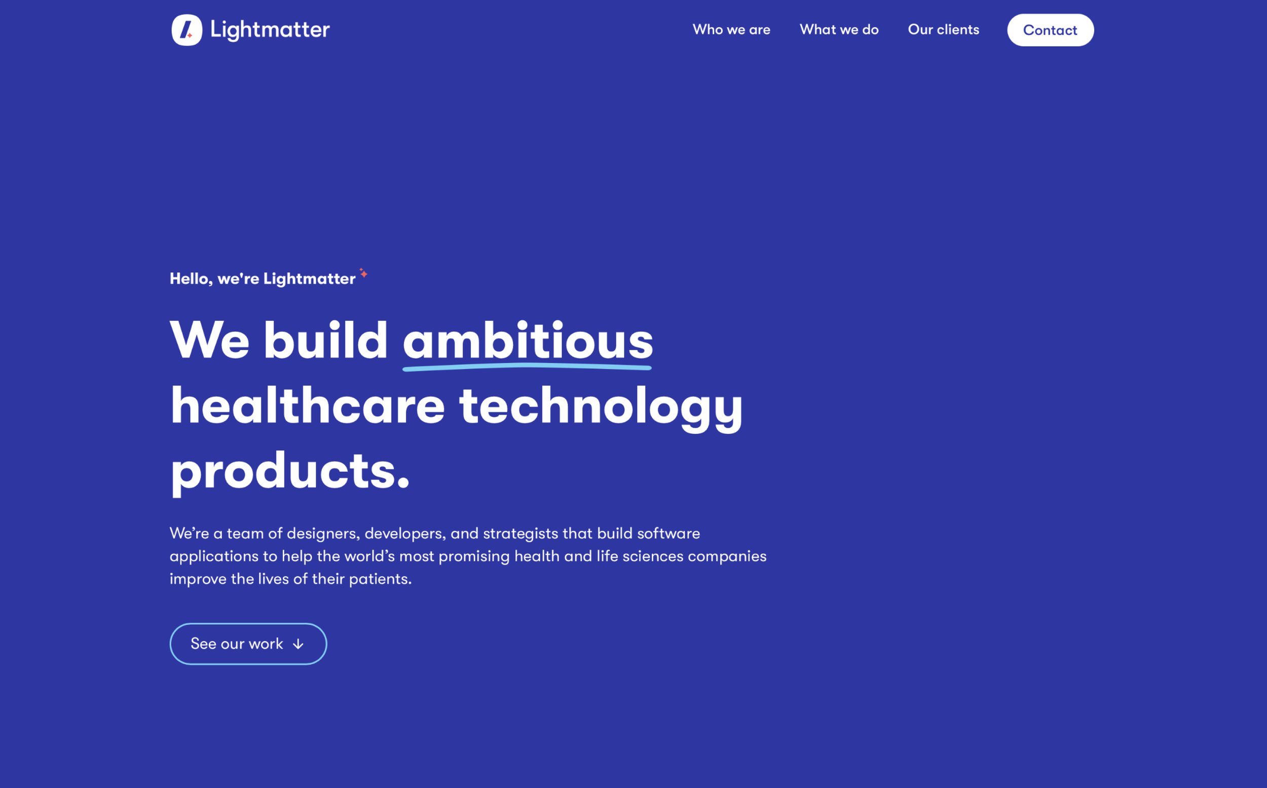
Navigation - I eliminated the hamburger menu and elevated the navigation to its primary tier.
Before
After
Type Hierarchy & Color - The previous site design faced an issue of uneven spacing due to the use of overly large typography in an attempt to compensate for the site's minimalist design. Working with my talented coworker Gabi, we rebuilt our type scale, opting for a more modest and less intrusive font size. In addition, we eliminated the use of blue-colored headlines and body text, opting instead for a clean and straightforward black-and-white palette.
Case Studies - Our previous website's case studies were constrained by a limited set of image/text layouts. Following our transition to Webflow, we gained the ability to present and describe our work in more captivating and diverse ways. Initially, we established a simple framework and structure for our case studies, and then tailored each one according to the scope and nature of our work for each client.
You can explore the revamped case studies here. The entire design team collaborated in crafting and developing each of them, and I'm super proud of the outcome of each case study.
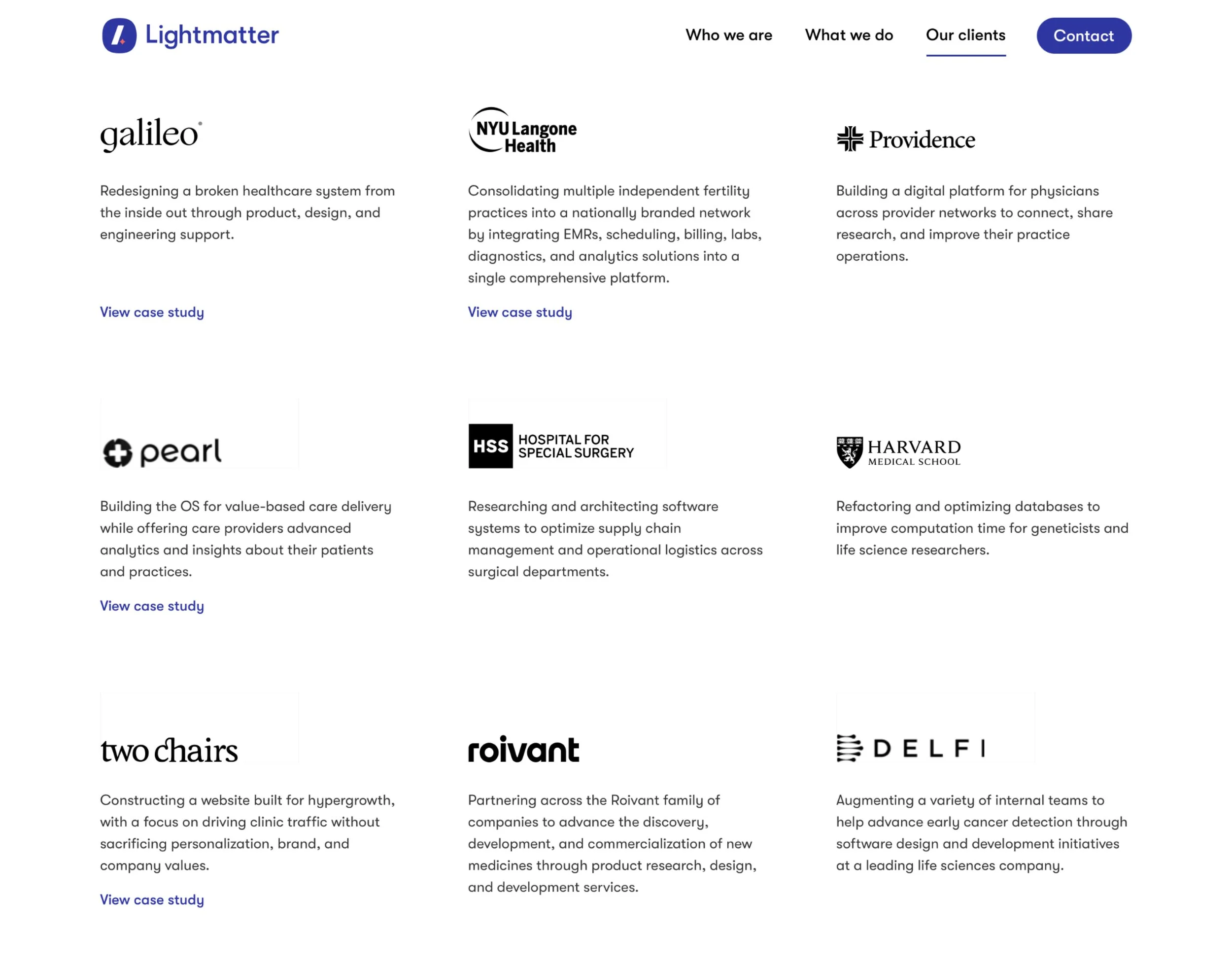
Our Clients page - Due to strict client NDAs, we can't always showcase all of our client work. To address this, I created a clients page with brief project summaries, logos, and service descriptions, enabling us to highlight our portfolio while protecting confidential information. This page also links to relevant case studies and websites we had built.
Iconwork - One small thing I wanted to add in was some icons I was able to make for the careers page. I had to dust off the ol’ isometric illustration skills, but I had a great time creating these:
The Outcome
After making the updates mentioned above, we felt we had leveled up the face of our company without being overly flashy. The new site was more professional and felt closer to the image we were looking to portray. Additionally, it empowered us to make regular updates without relying on the engineering team, which was a huge plus.
My Takeaways
The Figma + Webflow combo is just plain powerful. Mastering these two pieces of software allows any designer to essentially design and develop their own sites essentially without any restrictions. If you can design it, you can build it.
A lot can be designed with very little. Color-blocking and a solid font scale can negate the need to add in illustrations or photos to fill space.
Simpler is better. Cutting out unnecessary words and sections is best. Don’t over-state what can be said in very few words.
Subtle animations are the icing on the cake. Adding in a little bit of smooth motion to the site can elevate a user’s experience and can add necessary polish, especially to a portfolio. Webflow makes this super easy as well.


