
Levels Protein
Purposeful nutrition with minimal ingredients
I had the pleasure of working with Levels to help bring their brand & marketing into a more professional landscape. I spent over a year updating package designs, directing photo shoots, designing a brand new ecommerce site, and even filming/editing/managing my one and only branded video ad.
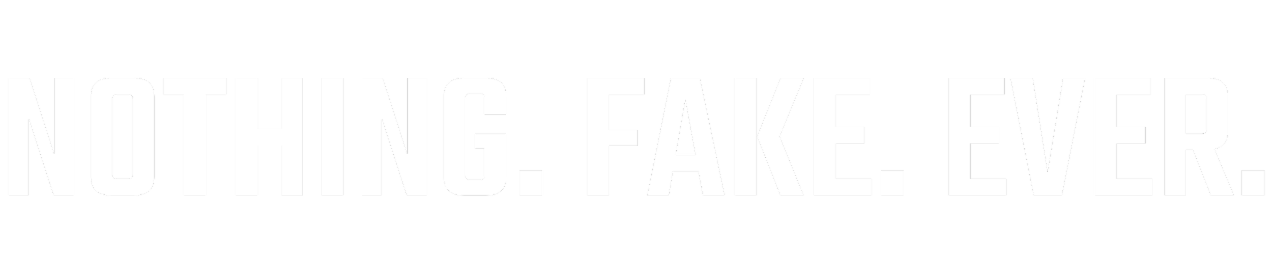
Blake, the founder of Levels, made it clear from the first day I met him that he wasn’t interested in bullshit. He was building Levels because he wanted to offer simple, clean products to people who actually cared about what they buy. One of my very first tasks was to create a simple tagline that summarized Levels.
Of the list we came up with, the tagline “Nothing. Fake. Ever.” was the clear winner and it allowed us to move forward in building and updating the rest of the brand guidelins for the Levels Brand.
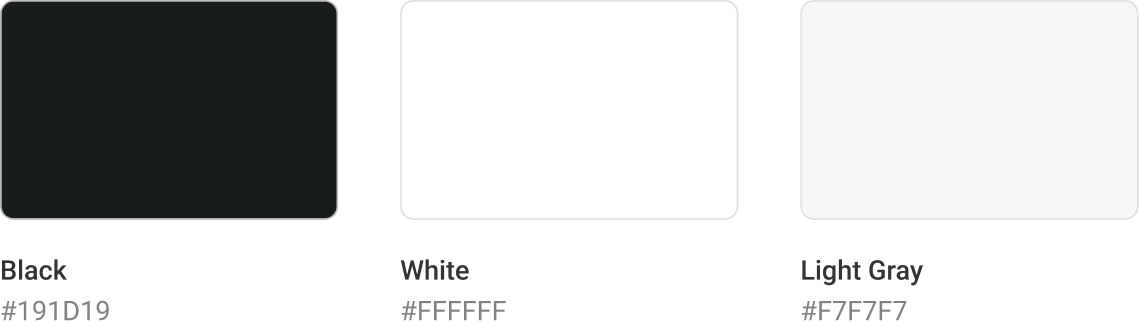
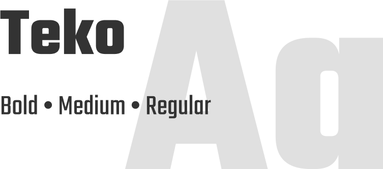
Brand Basics
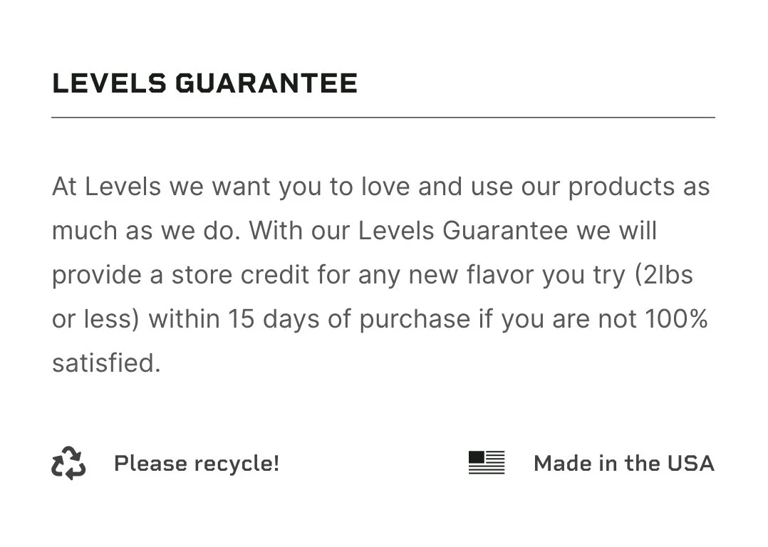
The Levels Brand is simple — Black, white, and gray; clean/minimal typography, and straightforward, sharp iconography.

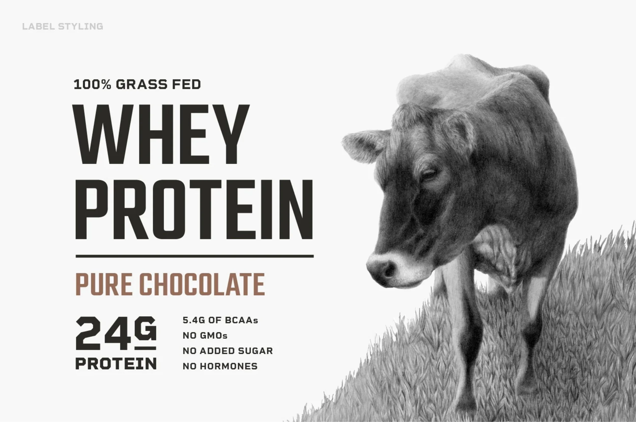
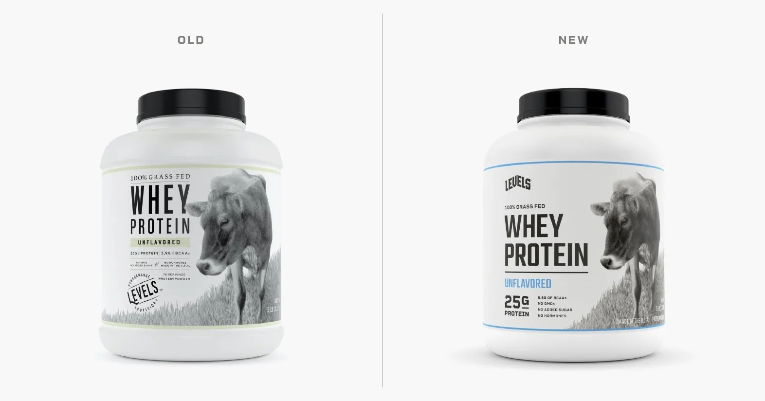
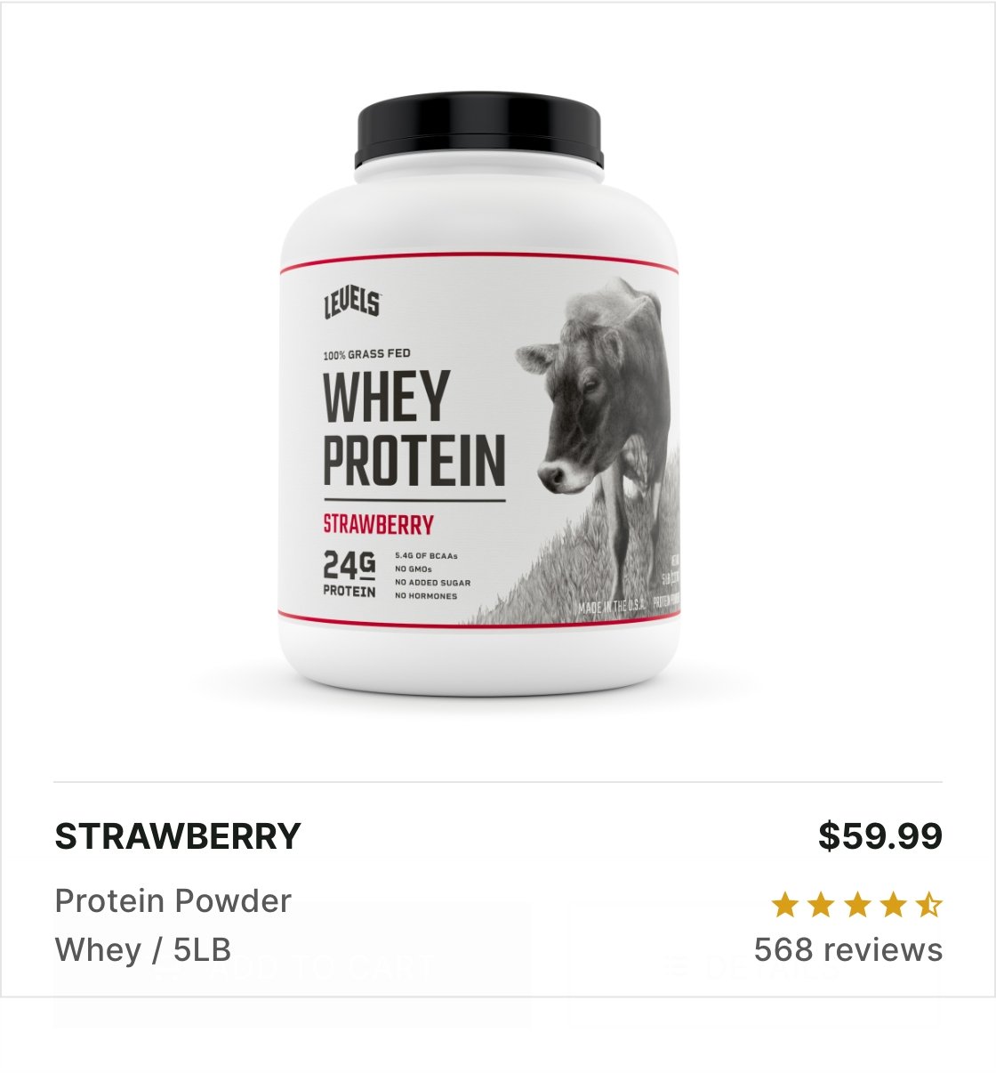
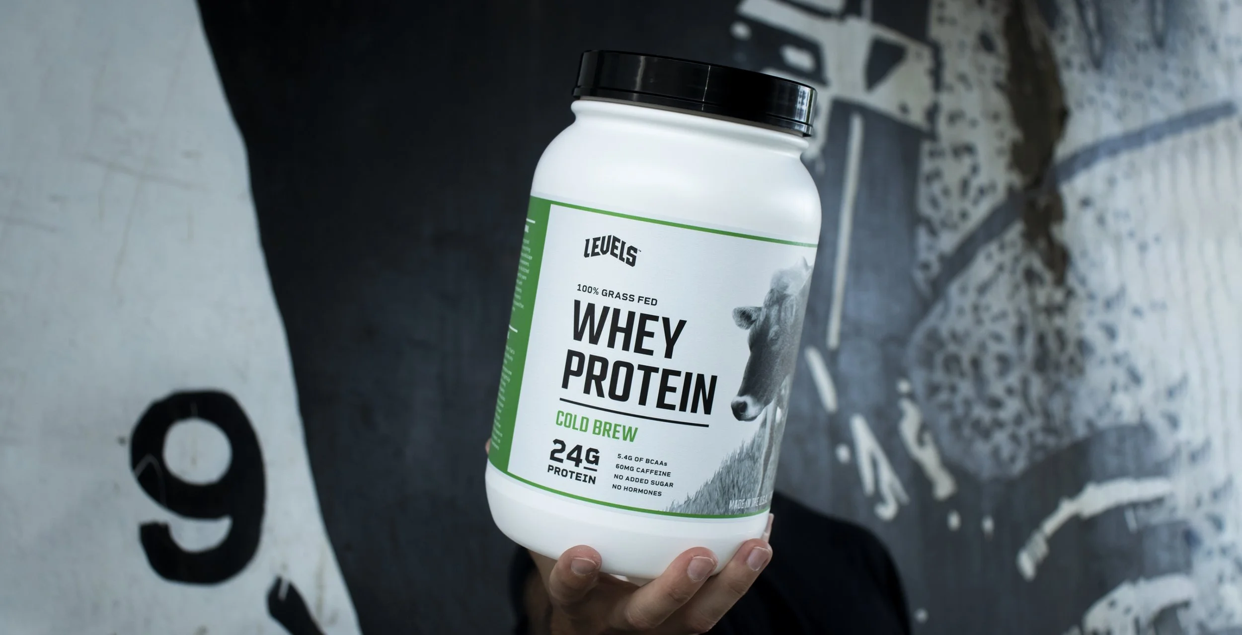
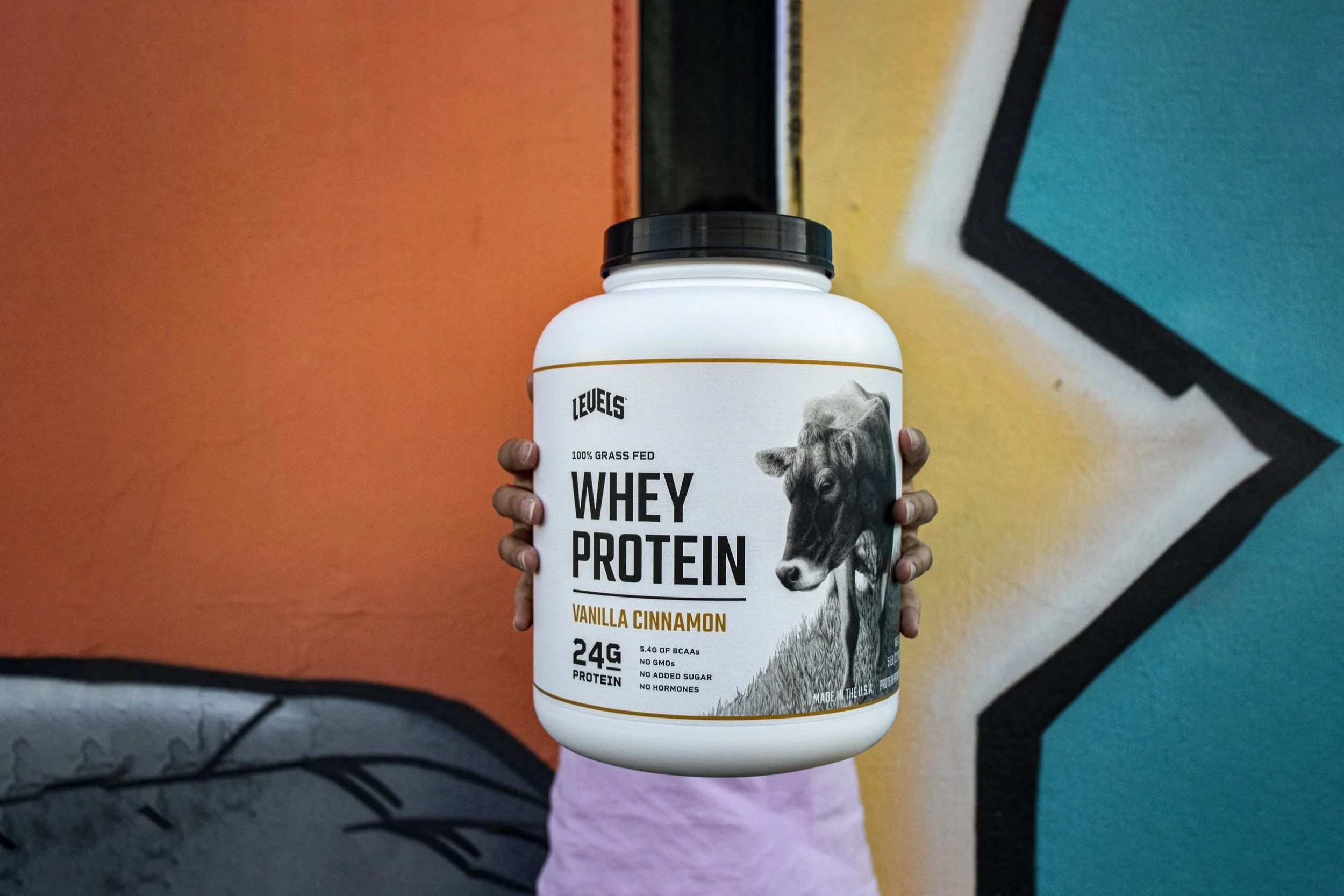
Packaging Designs
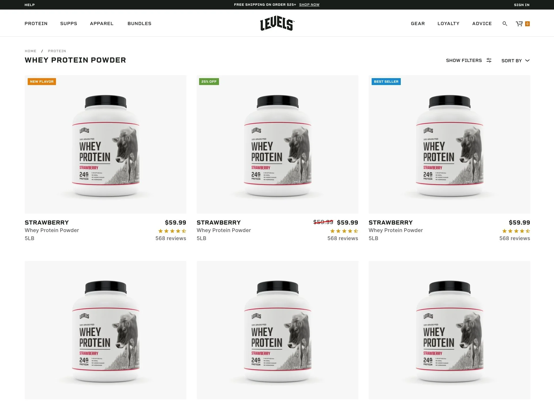
We kept it simple for our packaging too, focusing on what’s inside with the one stipulation that Bessie the cow was to stay.
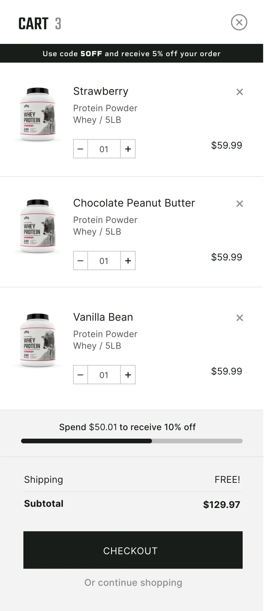
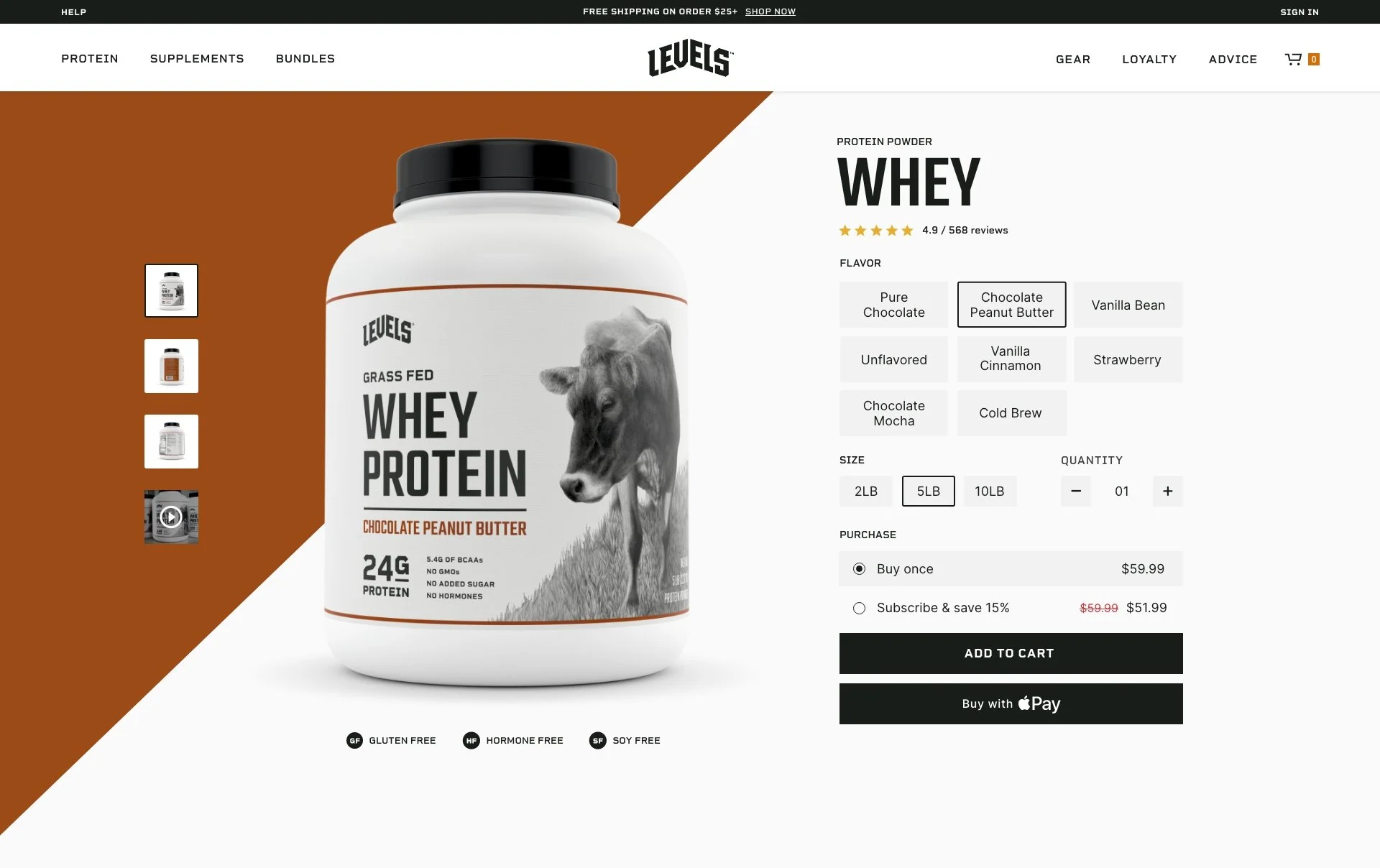
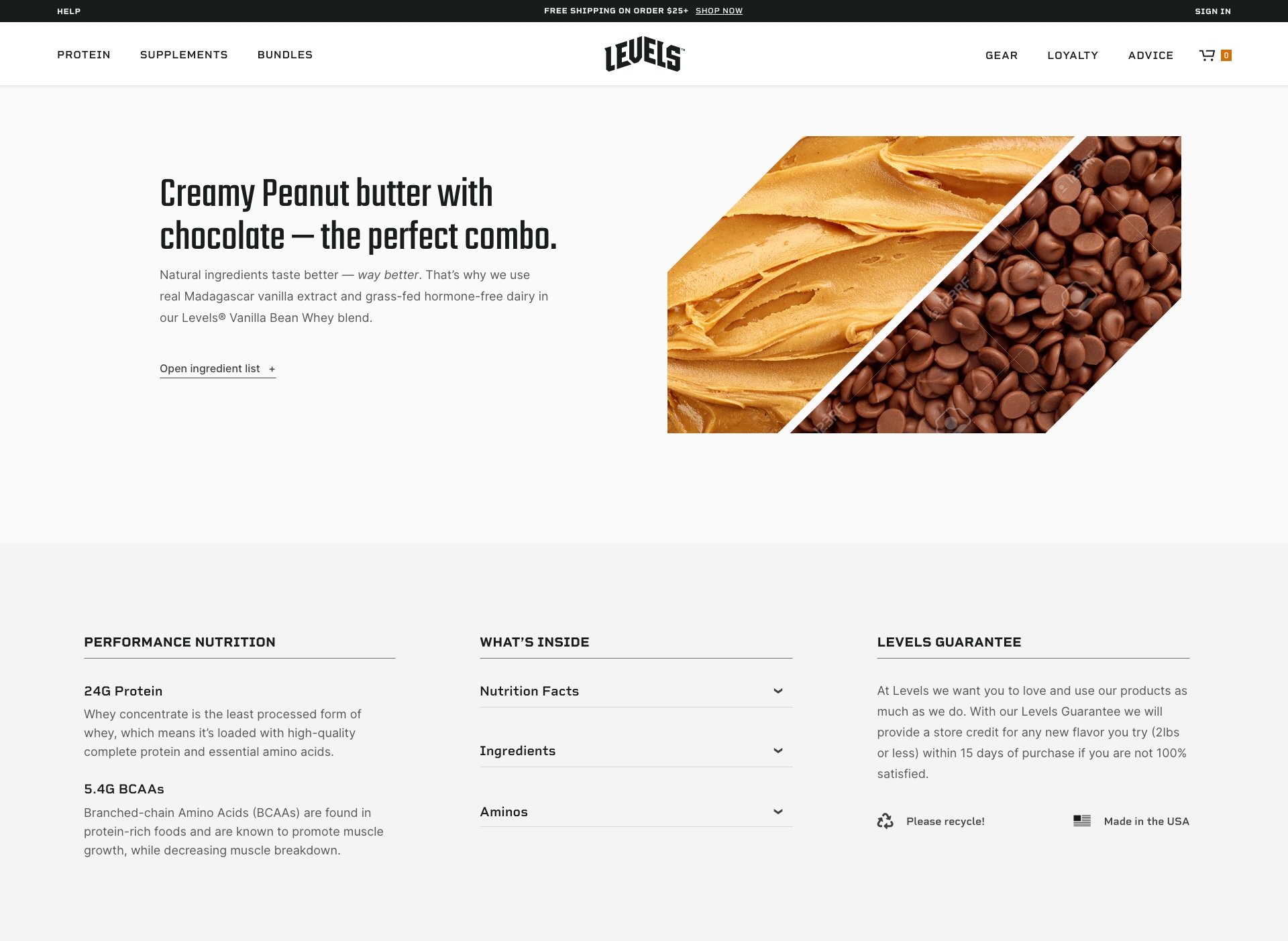
E-commerce Components
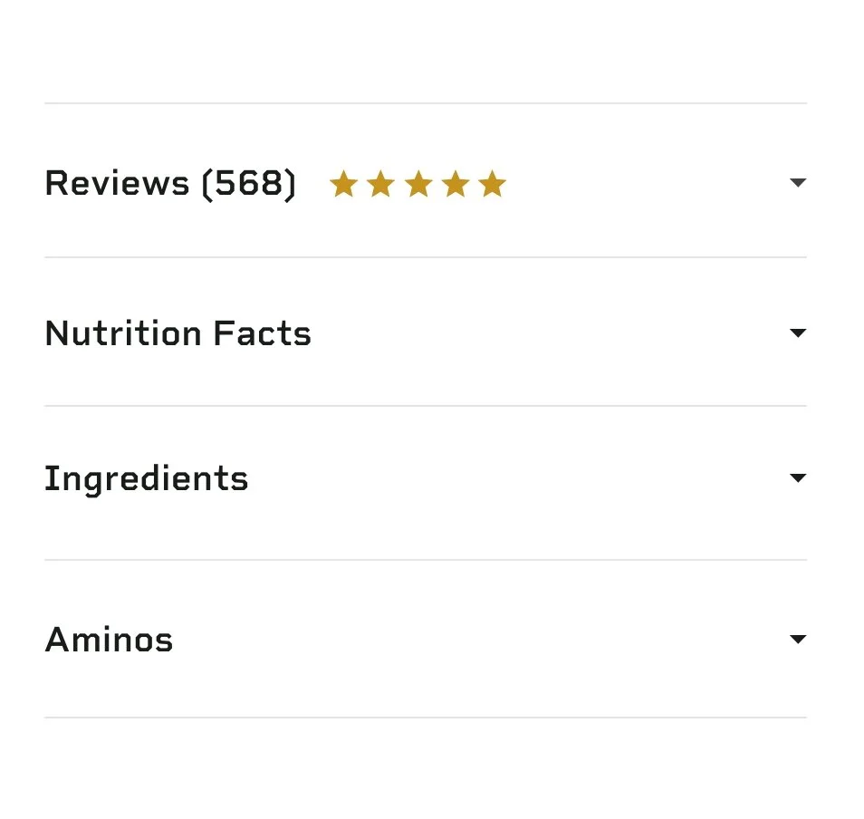
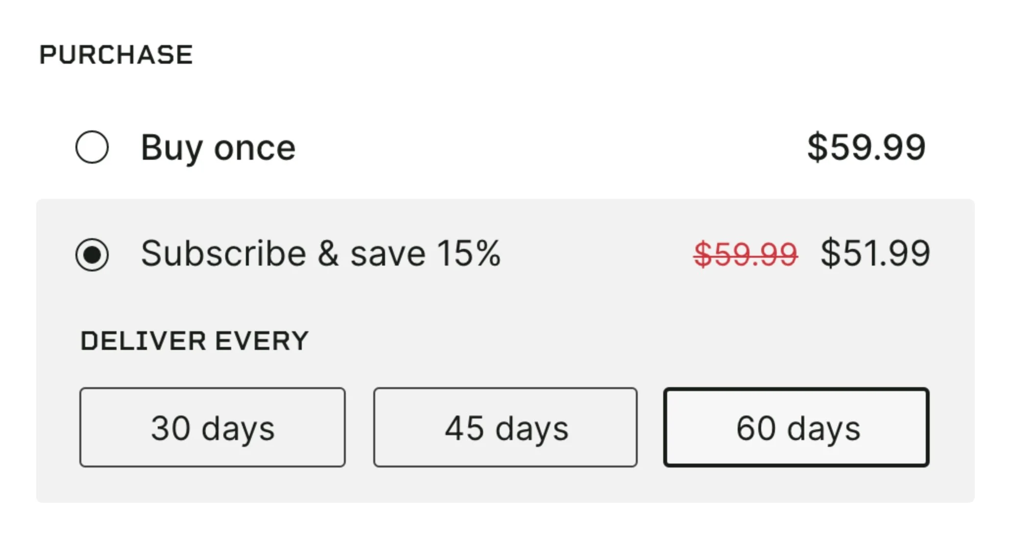
Our online shop carried the same super minimal feel, focusing on a foolproof nav and easy access to nutrition info, ingredients and reviews.

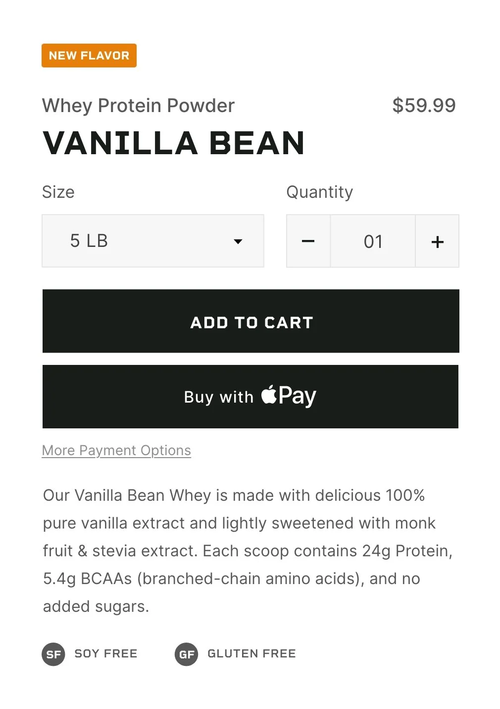
Ecommerce Design
Our online shop carried the same super minimal feel, focusing on a foolproof nav and easy access to nutrition info, ingredients and reviews.
The rest of the site design maintained the minimal aesthetic with a lot of whitespace, only using colors to indicate product flavors or callouts.
Website Designs
Video
I created a short advertising video to be used across our socials, website, Amazon shop pages. I wrote the script, storyboarded, hired the voiceover actor and helped organize the athletes. Everything was shot with my iPhone, and I did the editing on my own.
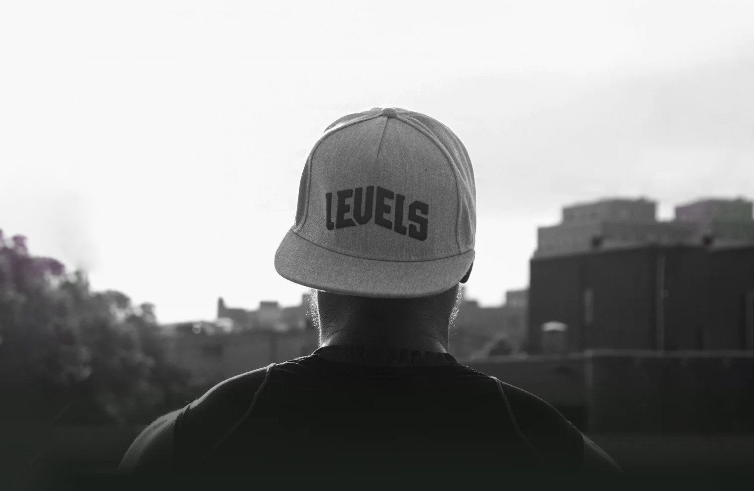
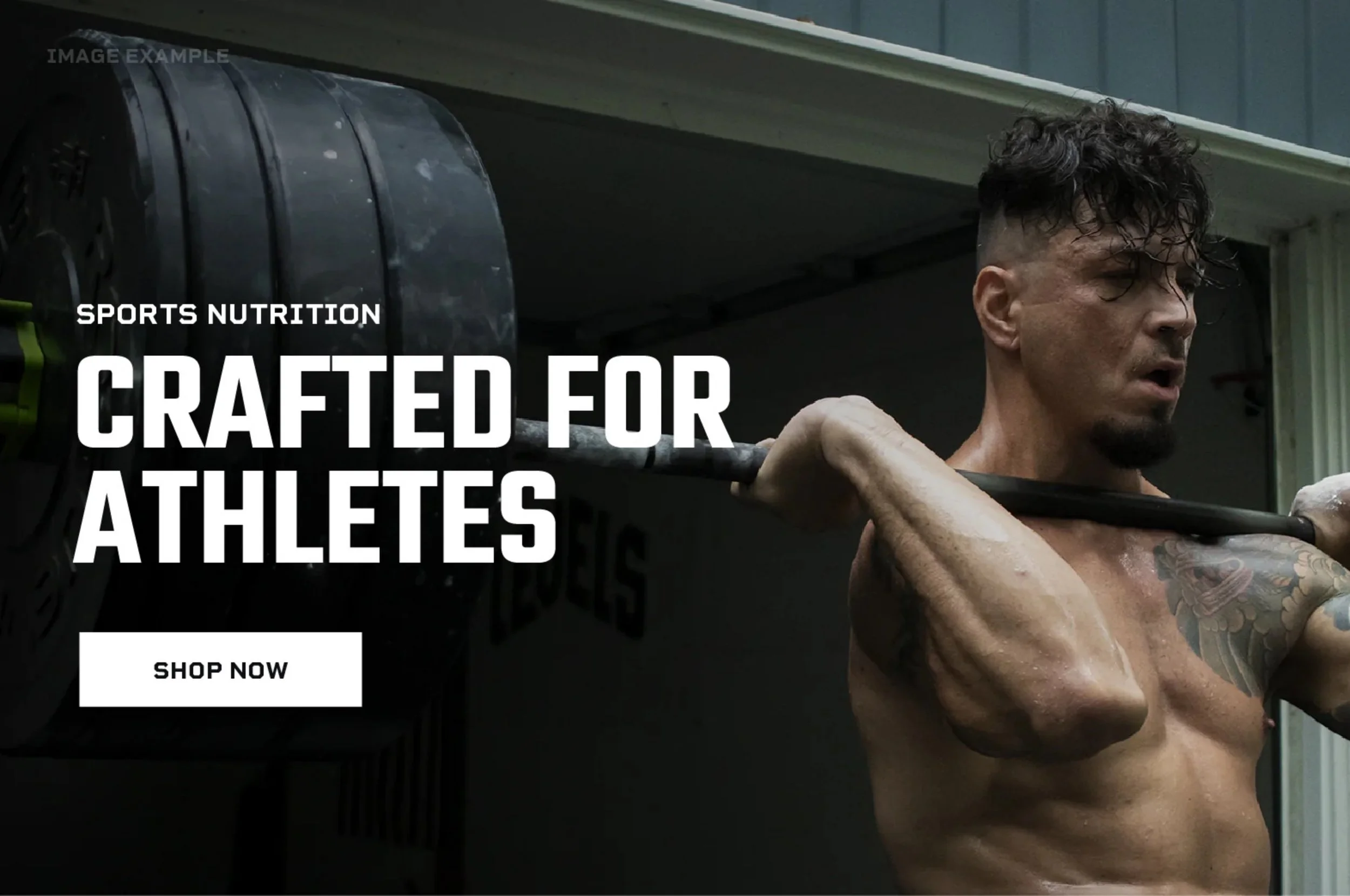
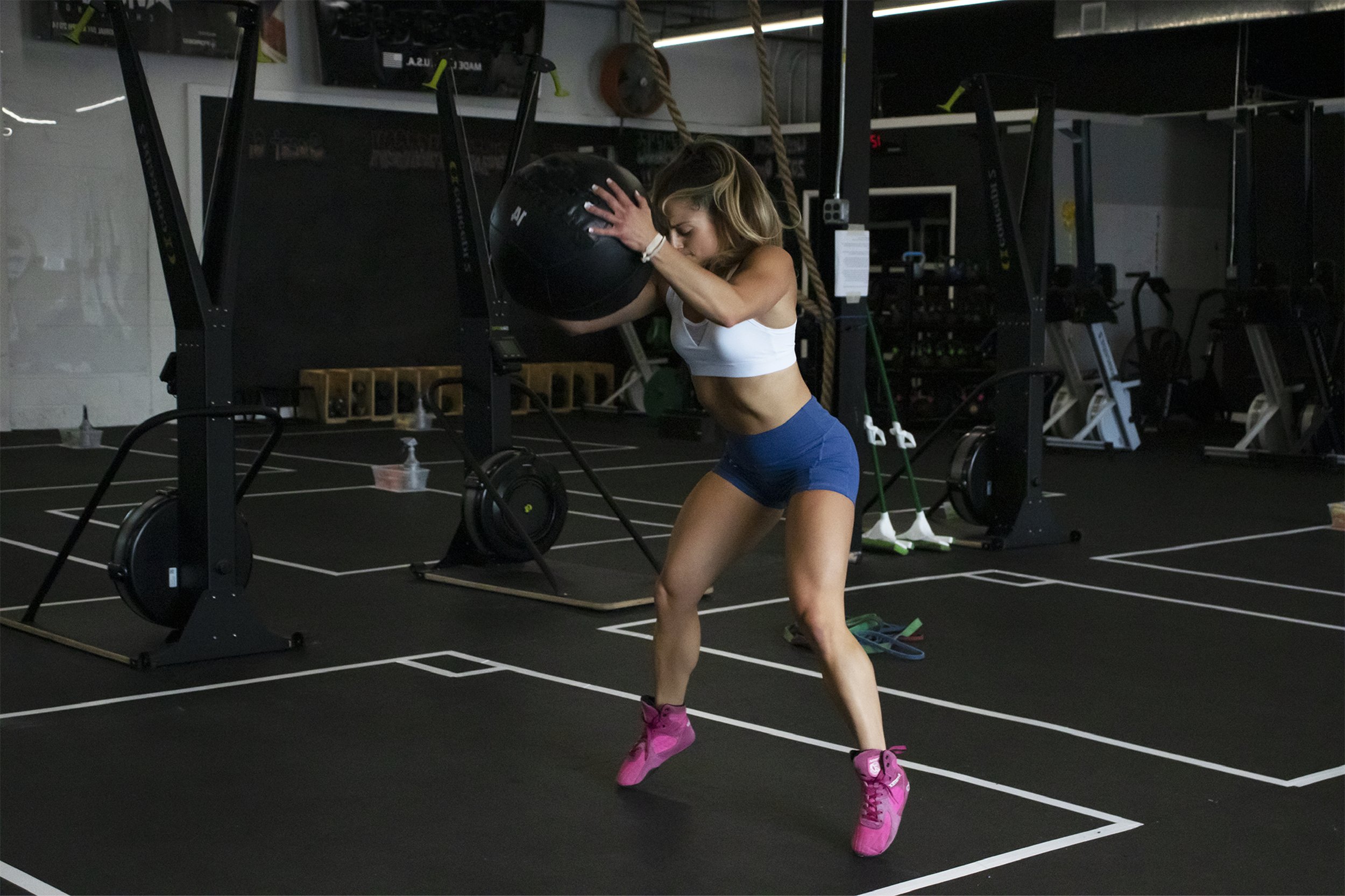
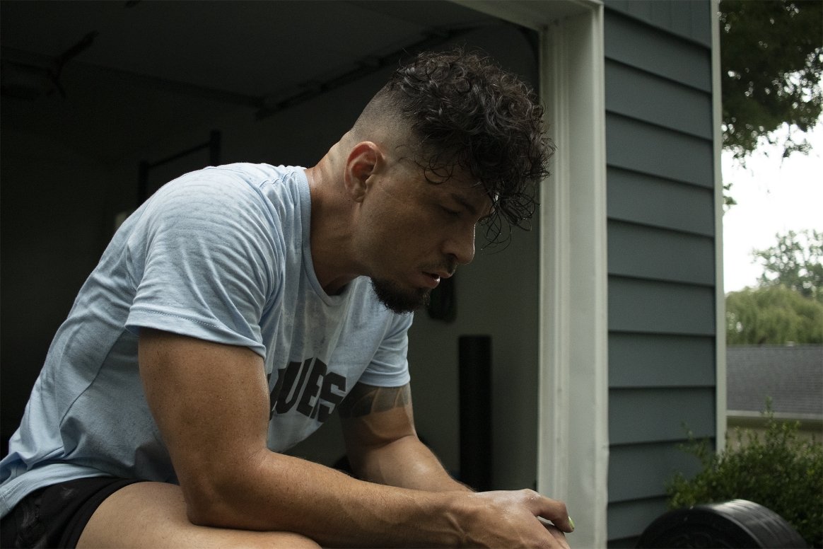
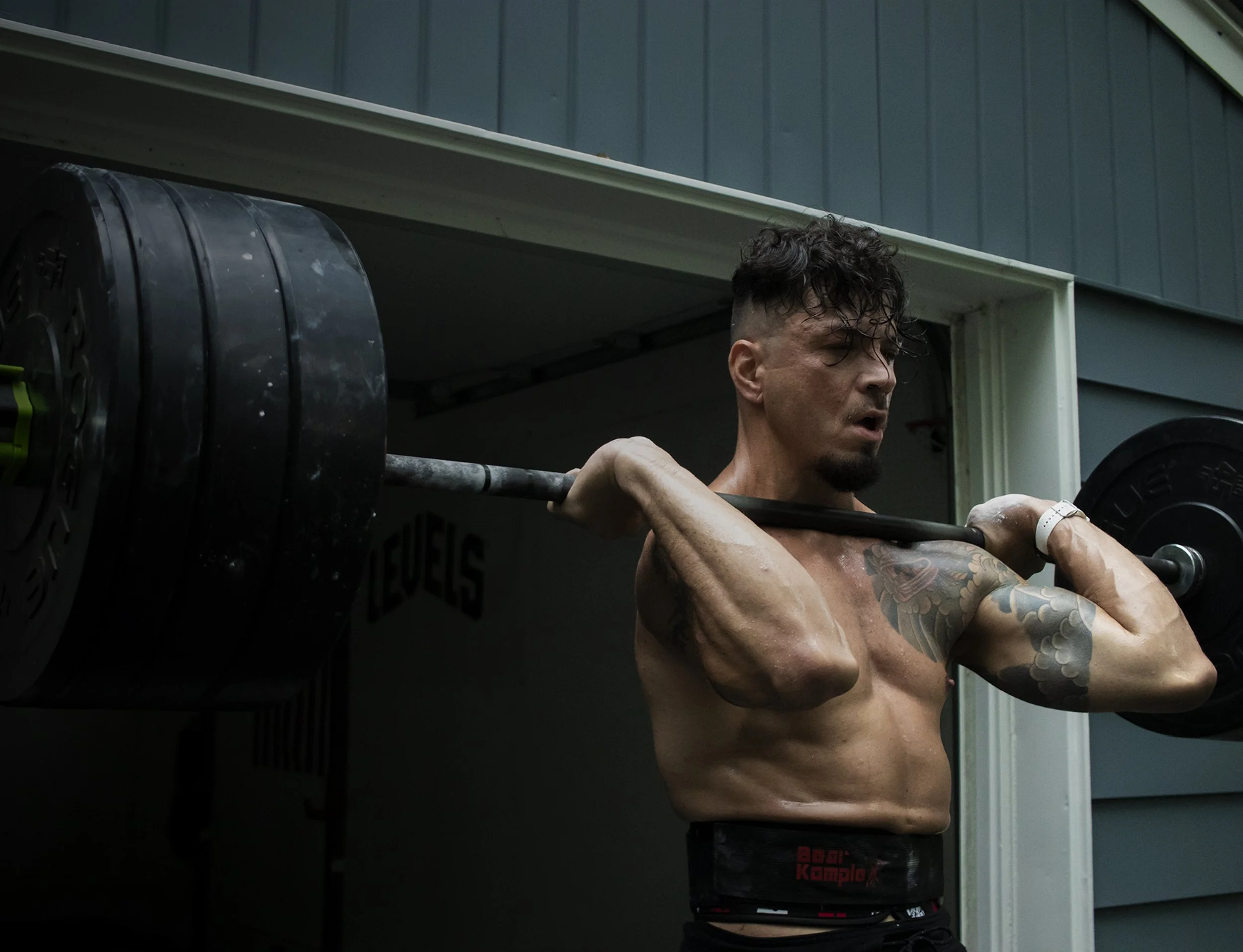
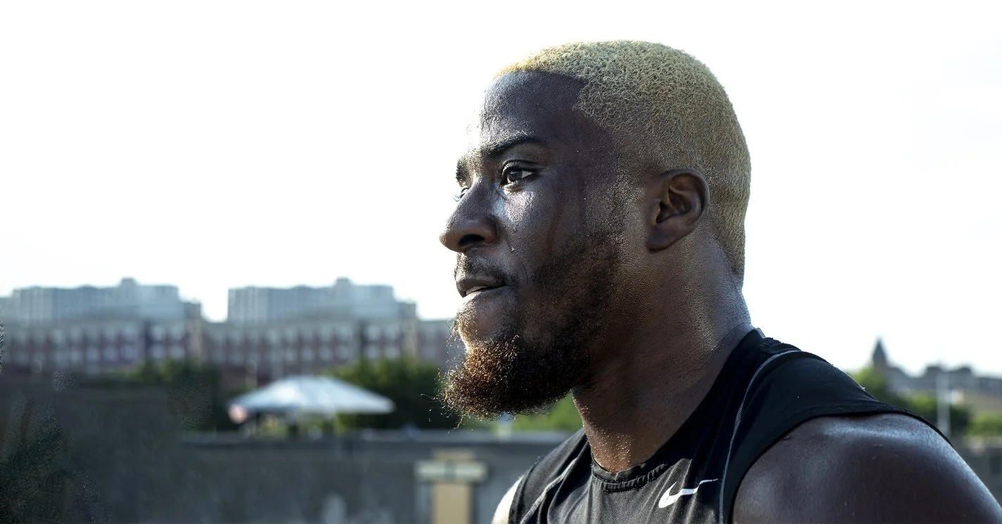
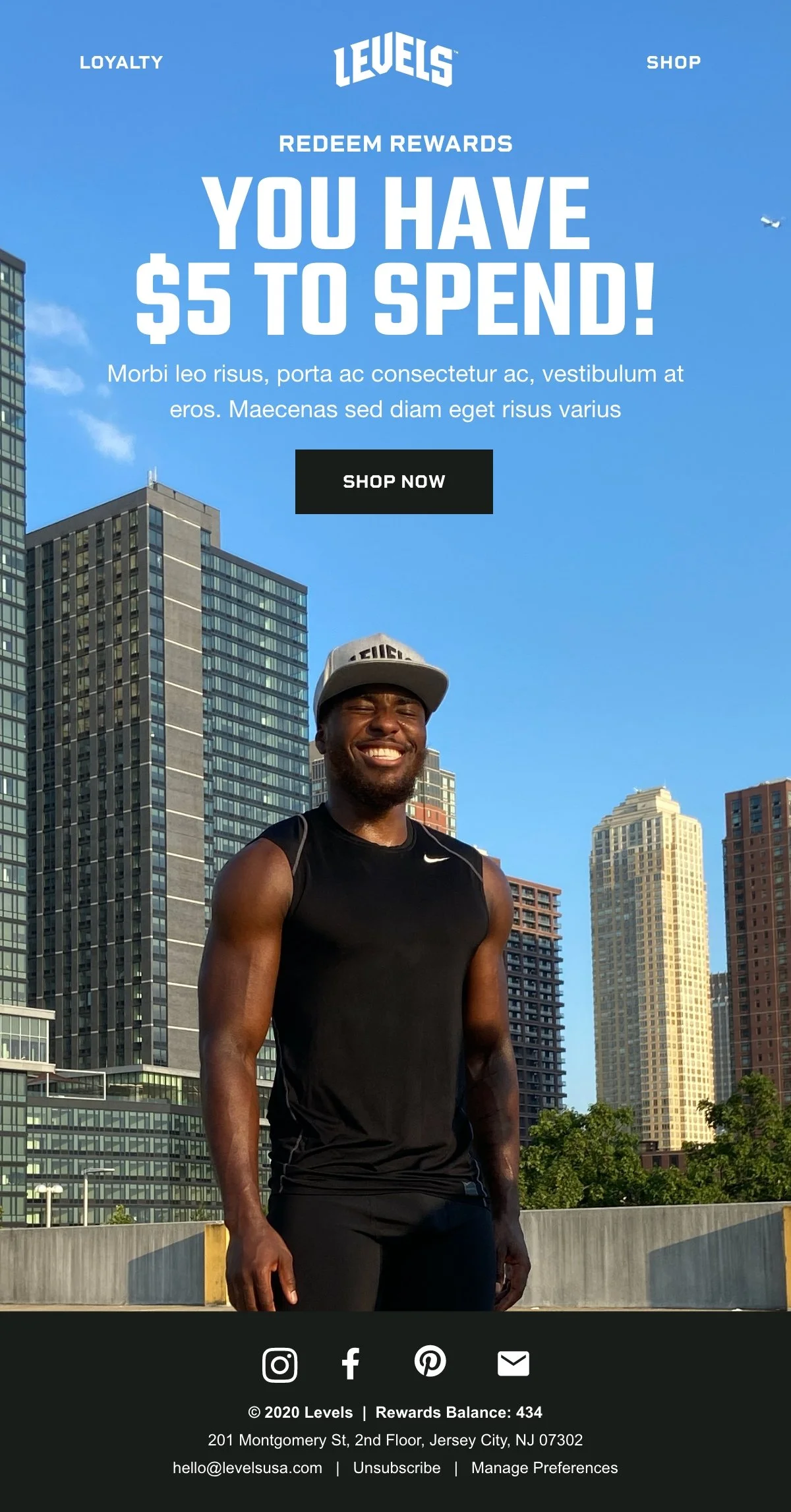
I wanted the athletes that represented Levels to be real people who really workout. Our photographic style caught athletes in the moment; sweat, grit, and all.
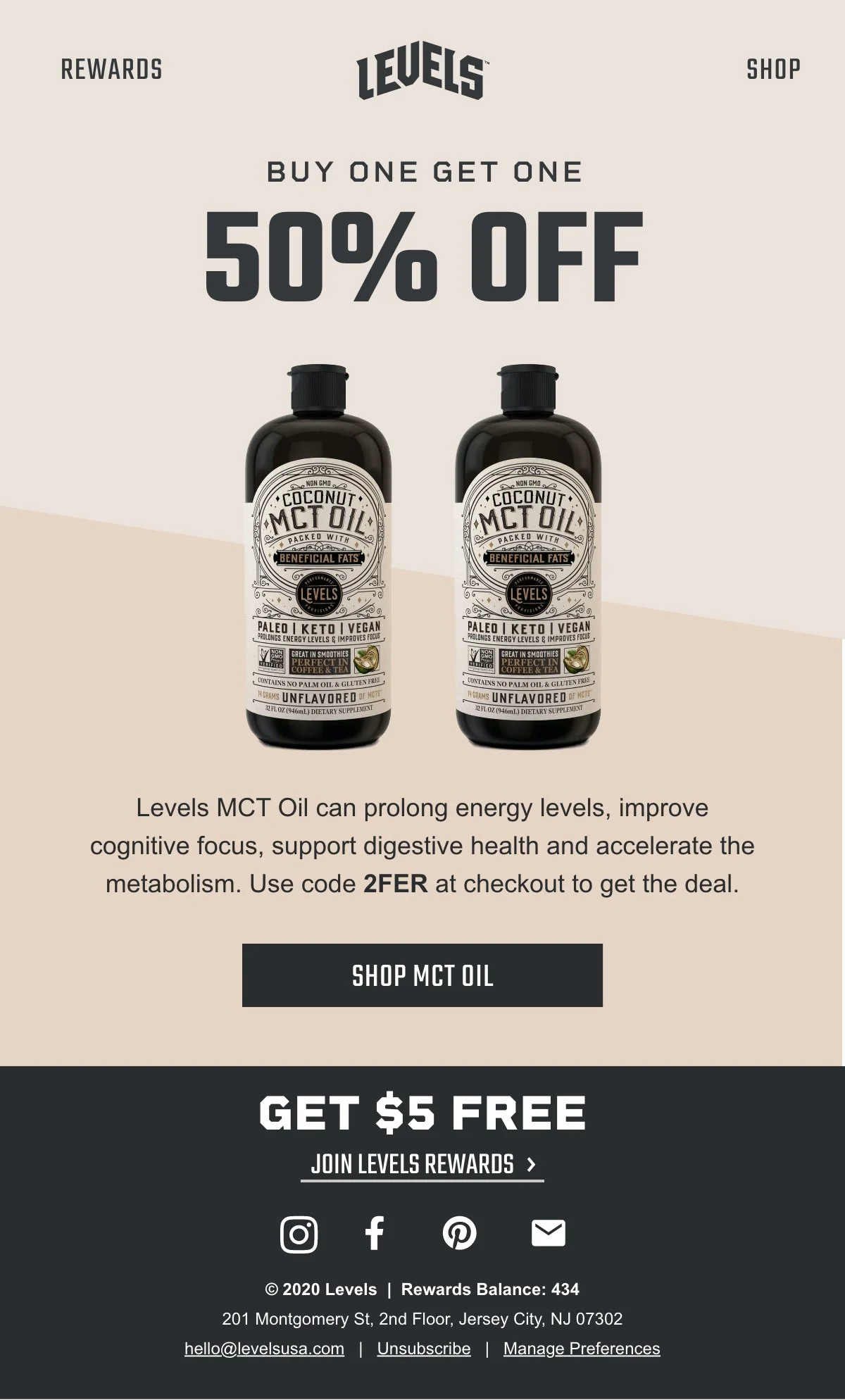
Our product photography was intentionally simple as well, using existing street art in our area of Jersey City as our backdrop.
Photographic Style
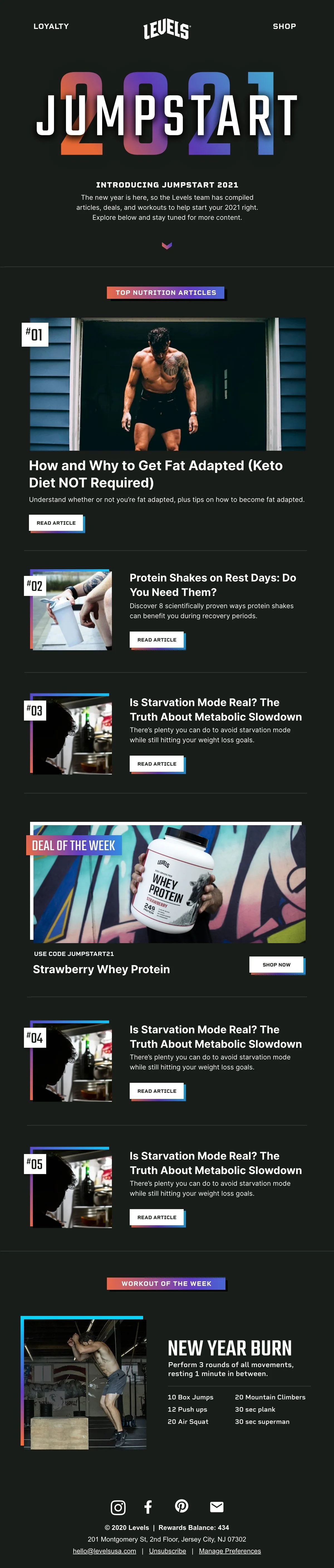
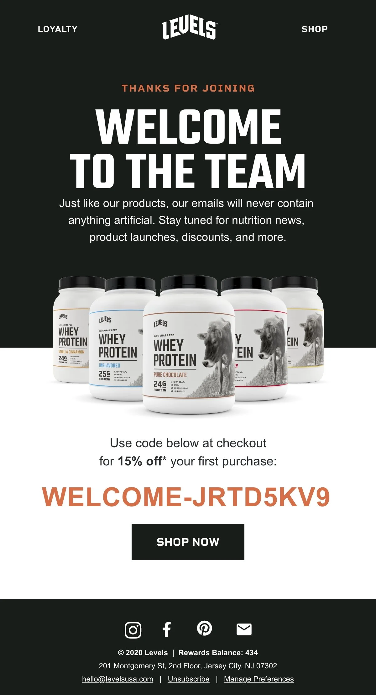
Email Designs
The designs I created for the Levels’ campaigns were meant to be a breath of fresh air in a customer’s inbox. I utilized our athletes’ photos as much as possible and focused on adding quality health content from our blog wherever I could.
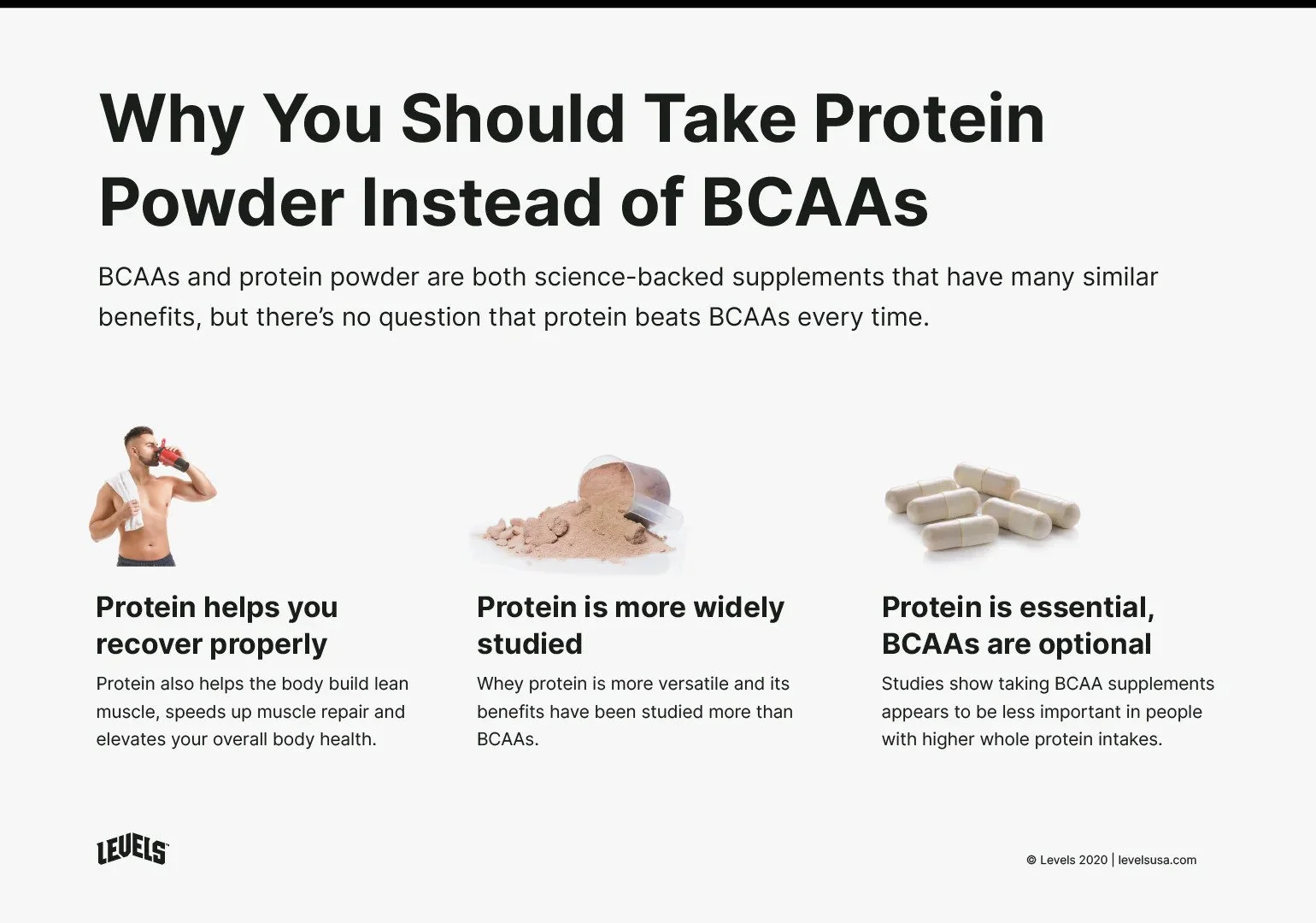
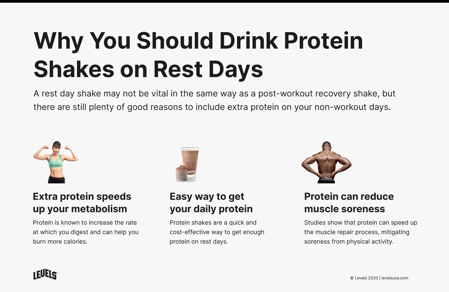
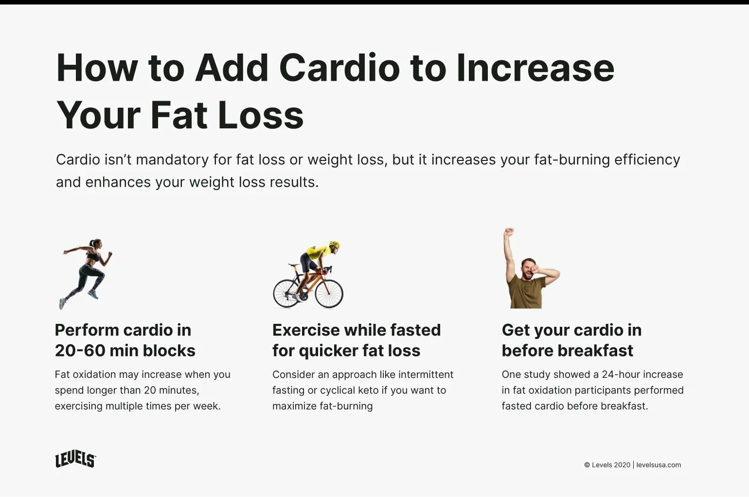
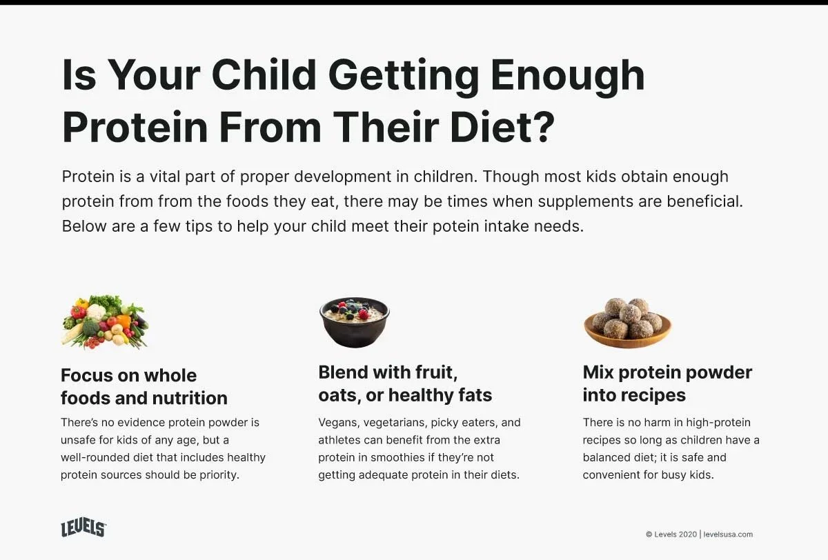
Infographics
We needed infographics that were both eye-catching, but easy to reproduce, so we opted to use stock photography in place of custom icons or illustrations.
These designs helped us to very quickly create quick infographics that were just different to catch someone’s eye to pin to their health-n-fitness journey boards or what have you.
Head over to Levels’ Site to check out my work.
Most of what I created while at Levels is still being used today.

Next Project