Just a place for me to put stuff
Work stuff, life stuff, update stuff.
Stem Cell Journal Cover Art
Cover art concept for stem cell publication

My sister-in-law is a Pulmonary Critical Care Doctor and dedicated Researcher at Boston University. Recently, her team's research garnered recognition with the selection of two scientific papers for publication in the medical journal known as Stem Cell. She reached out to me for assistance in crafting an illustration to be considered as a potential candidate for the journal's cover art.
The initial concept revolves around the transformation of pluripotent stem cells into puzzle pieces seamlessly integrating into damaged lung tissue, symbolizing their healing capabilities. The vibrant green hue in the artwork is derived from the dye employed for identifying these cells.
Below are the initial concepts I had sent over to her team:


We ended up moving forward with the middle concept, so I updated the styling to add more depth and texture. We also dropped the ‘morphing’ cell concept and went with a more subtle puzzle piece texture with a more obvious puzzle piece filling in gaps in the lung illustration. At this stage I also played around with some alternative coloring and some extra styling with the white stroke.


The feedback from here was:
Add the green coloring back to the puzzle pieces
Add in additional missing pieces to show how the cells can target multiple damage sites in the lungs.
Scatter some extra pieces around the lungs
I also added with more depth into the illustration and lightened the background to a more desaturated blue to balance the brighter green of the cells. The final version is below:
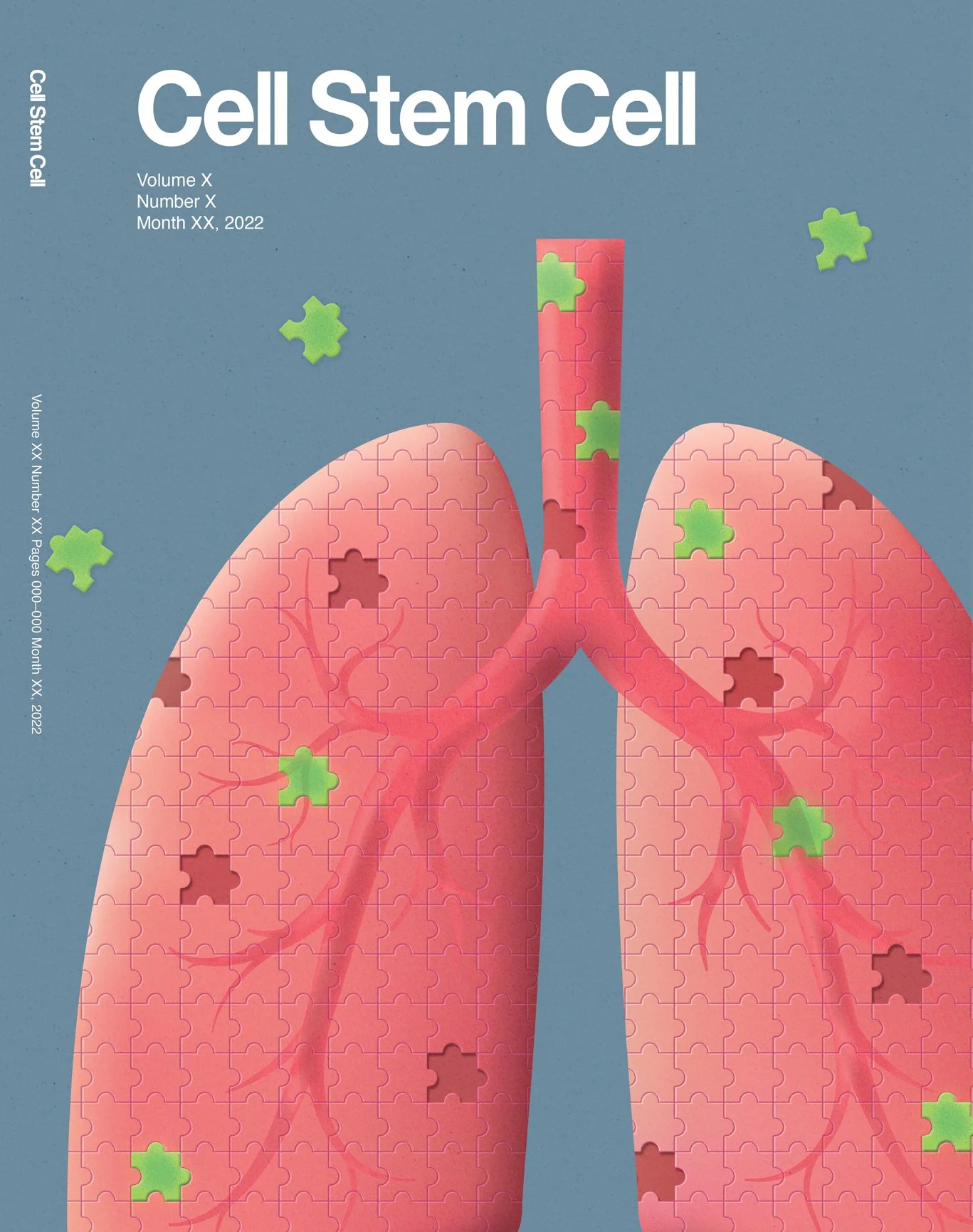
Unfortunately, Stem Cell did not pick our cover (the one they chose is awesome and very different). The good news is, my sister-in-law’s team is using my illustration across presentations and other materials.
Lung Cancer Lab Software Design

Quick Note: I’ve been asked not to show any flows or additional screens as these are very proprietary software designs that the company would prefer I not share publicly.
Overview
While at Lightmatter, I had the opportunity to work with a laboratory that in short, is able to detect lung cancer in smoking patients via blood samples. We spent over 6 months defining and redefining the interface from scratch to be able to handle the entire processing of the blood samples from creating the original orders on the providers’ ends all the way to reporting results back to the patients.
The Challenges
Given there was such a wide variety of requirements by so many different teams software, the biggest challenge was creating a interface that was simple and clean, but powerful enough to handle everything they needed as they did not want to use disparate softwares for each team.
The list below encompasses the range of features that I was able to deliver:.
High Level
Overview of blood sample progress through system with legal requirement for very granular audits
Ability to move orders from step to step until order is complete
Communication and messaging across teams (via ‘conversations’)
Information error management via case creation (see right panel)
Provider and patient indexes with search and filtering
Uploads section for any documents/images
Ordering
Ability for Doctors to submit blood work prescription to phlebotomist on behalf of patient
Insurance & billing capture
Edibility of patient information per section/across all sections (see global edit toggle in bottom left)
Barcode creation modal for blood sample identification
Lab intake
Intake of blood samples including barcode scanning and sample
Error tracking and resolution (broken test tubes, dried samples, etc…)
Sample Processing
Quality Control metrics visualization to compare sample results to baseline
Ability to create holds on samples in cases of potentially faulty data
Data visualization tools and sample grouping (blood sample grouping is extremely tedious and detailed!)
Reporting
Ability to create and send results to patients and providers
Error management and resolution in reporting
This list above, along with testing across each and every team via clickable prototypes and flows, while receiving input from 30+ members of the company’s team was an added challenge. That said, this was hands-down one of my favorite projects given the complexity and problem-solving.
The outcome
I worked in tandem with the engineering team to essentially develop the application in real time. The timeline was extremely short for the list of ever-growing requirements, but after 6 months, the software was already built and functioning based on my designs. I was also able to deliver a full software design guideline along with templates for any future requirements they may have come across. I spoke with their team recently and it sounds like they are still using the designs I’ve created and have used my guidelines to build more features into their pipeline.
My Takeaway
My experience in branding and visual design, including icons, logos, websites, and marketing materials, has been incredibly rewarding. I've seen my work featured on NYC Subway ads, prominent billboards, and even in Google's early icon collection.
This project helped me find an deeper interest for complex, multi-dimensional problem-solving that demands collaboration with bigger teams. I’m very proud of the work we did in delivering a solid foundation for the company to grow with.
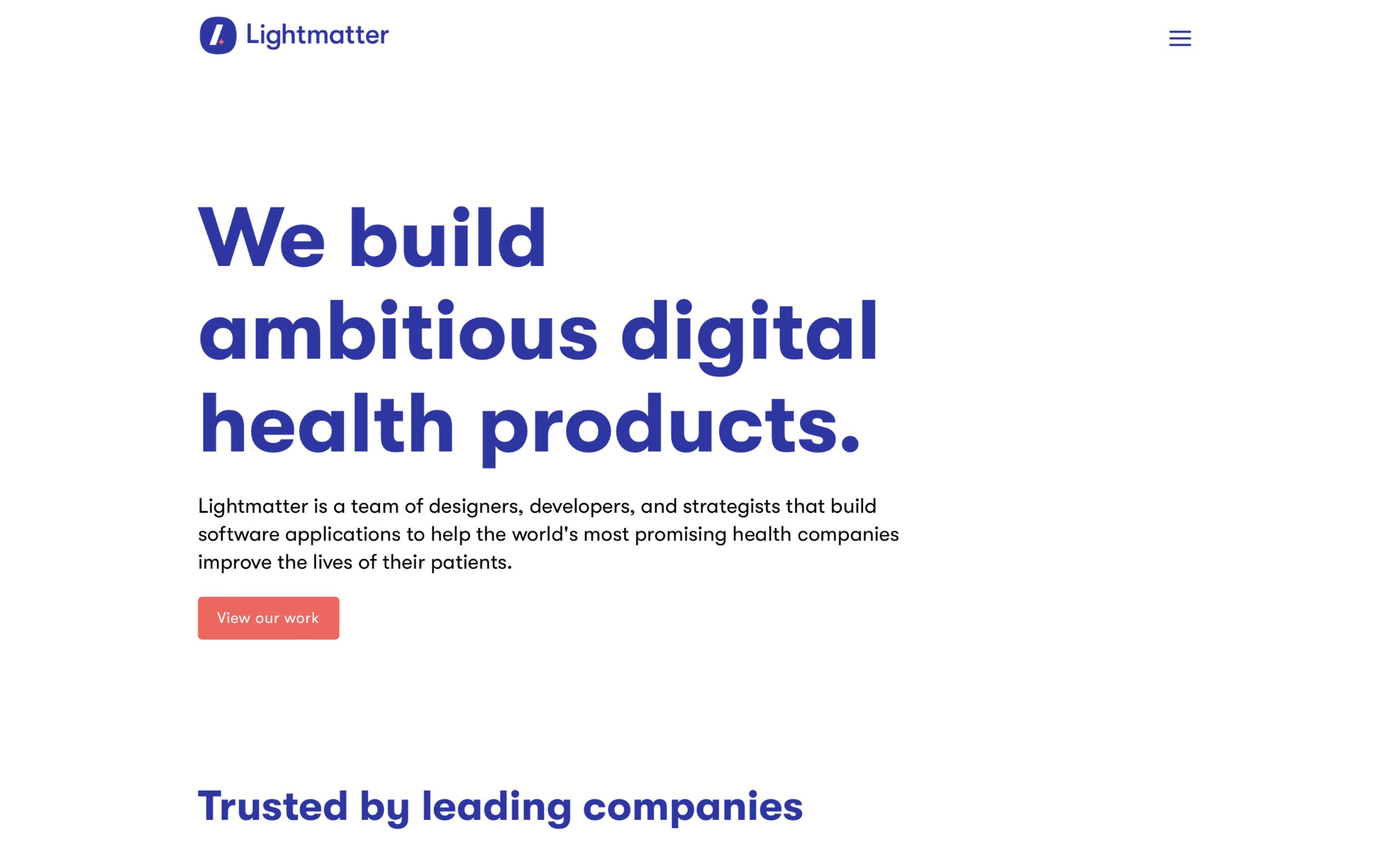
Lightmatter.com Redesign
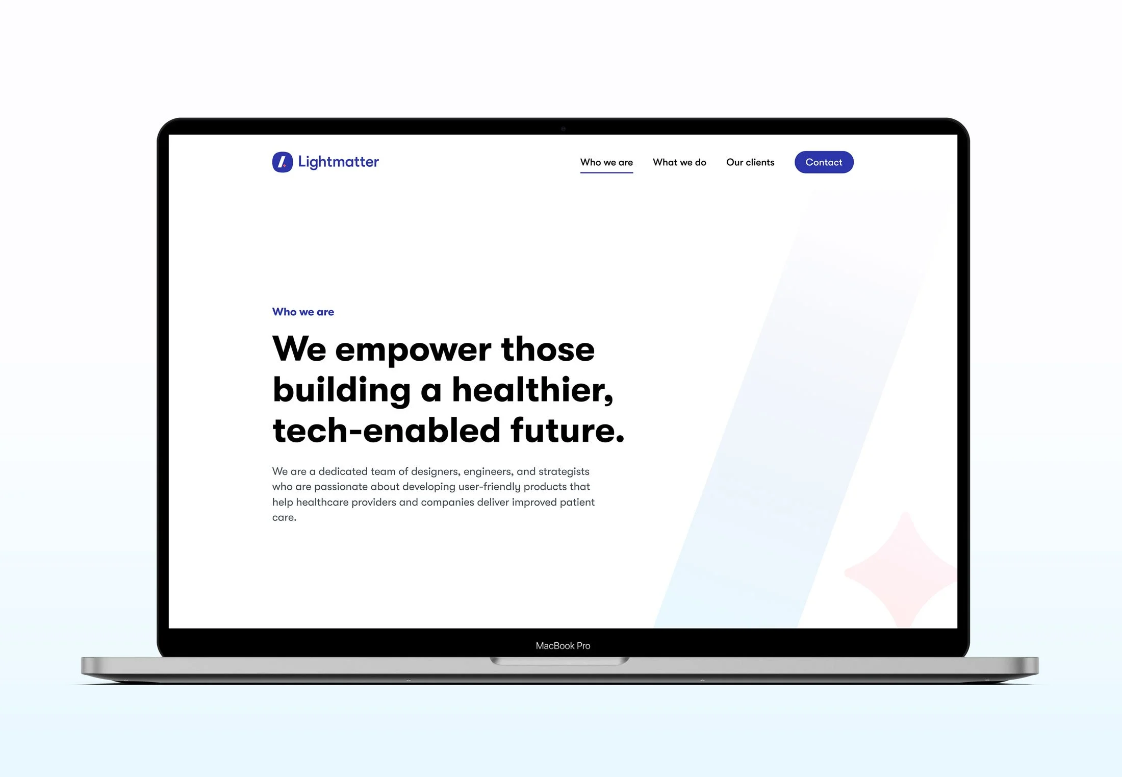
Overview
In between client work at Lightmatter, the design team would update internal UX/UI design systems or use the time to update presentations, create blog post illustrations, etc. After making the decision to work exclusively with healthcare and wellness clients, we were in need of completely redesigning our site. Up until this point, we were using a re-skinned version of our previous portfolio and it was no longer able to grow with us, so it was time to redesign!
You can visit the new site design here.
The Challenges
Lightmatter's brand is intentionally minimal, requiring a clean yet substantial design.
The need to showcase work without revealing proprietary designs led to a unique challenge.
The original website was built on Wagtail CMS. It was powerful but inflexible; we needed a more adaptable solution.
We needed straightforward, distinct site, avoiding flashy elements, confusing navigation, and the forever distasteful scroll-jacking.
From Wagtail to Webflow
We recognized the need to transition to a more adaptable platform. Our existing website was constructed using Wagtail, a CMS really only designed simple content updates, but proved challenging when it came to making visual adjustments. Our goal was to find a solution that not only made for easy updates but also eliminated the need for engineering resources during the development process. Webflow was the obvious choice, excelling in both areas.

Updates we made
Navigation - I eliminated the hamburger menu and elevated the navigation to its primary tier.

Before

After
Type Hierarchy & Color - The previous site design faced an issue of uneven spacing due to the use of overly large typography in an attempt to compensate for the site's minimalist design. Working with my talented coworker Gabi, we rebuilt our type scale, opting for a more modest and less intrusive font size. In addition, we eliminated the use of blue-colored headlines and body text, opting instead for a clean and straightforward black-and-white palette.
Case Studies - Our previous website's case studies were constrained by a limited set of image/text layouts. Following our transition to Webflow, we gained the ability to present and describe our work in more captivating and diverse ways. Initially, we established a simple framework and structure for our case studies, and then tailored each one according to the scope and nature of our work for each client.
You can explore the revamped case studies here. The entire design team collaborated in crafting and developing each of them, and I'm super proud of the outcome of each case study.
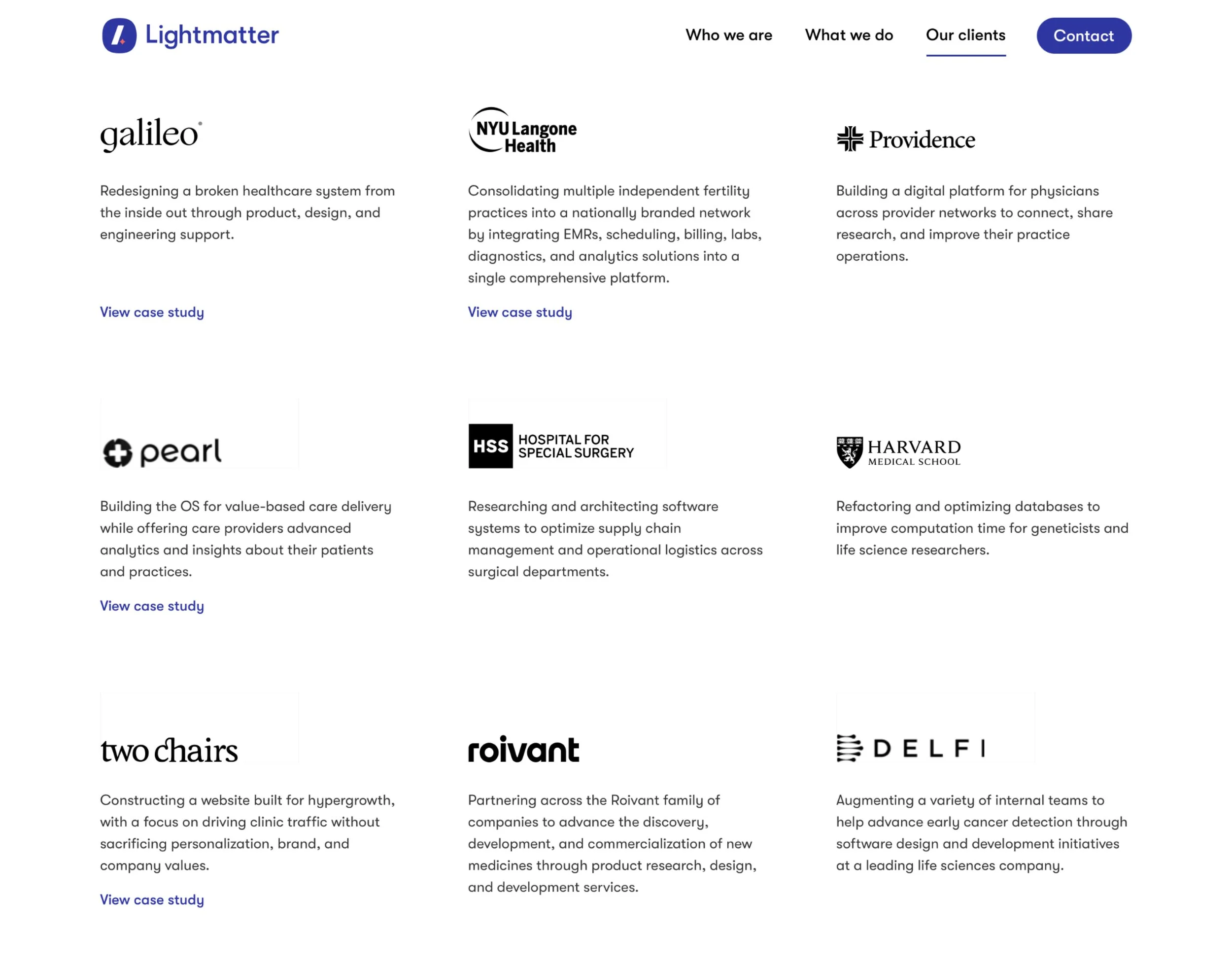
Our Clients page - Due to strict client NDAs, we can't always showcase all of our client work. To address this, I created a clients page with brief project summaries, logos, and service descriptions, enabling us to highlight our portfolio while protecting confidential information. This page also links to relevant case studies and websites we had built.
Iconwork - One small thing I wanted to add in was some icons I was able to make for the careers page. I had to dust off the ol’ isometric illustration skills, but I had a great time creating these:

The Outcome
After making the updates mentioned above, we felt we had leveled up the face of our company without being overly flashy. The new site was more professional and felt closer to the image we were looking to portray. Additionally, it empowered us to make regular updates without relying on the engineering team, which was a huge plus.
My Takeaways
The Figma + Webflow combo is just plain powerful. Mastering these two pieces of software allows any designer to essentially design and develop their own sites essentially without any restrictions. If you can design it, you can build it.
A lot can be designed with very little. Color-blocking and a solid font scale can negate the need to add in illustrations or photos to fill space.
Simpler is better. Cutting out unnecessary words and sections is best. Don’t over-state what can be said in very few words.
Subtle animations are the icing on the cake. Adding in a little bit of smooth motion to the site can elevate a user’s experience and can add necessary polish, especially to a portfolio. Webflow makes this super easy as well.
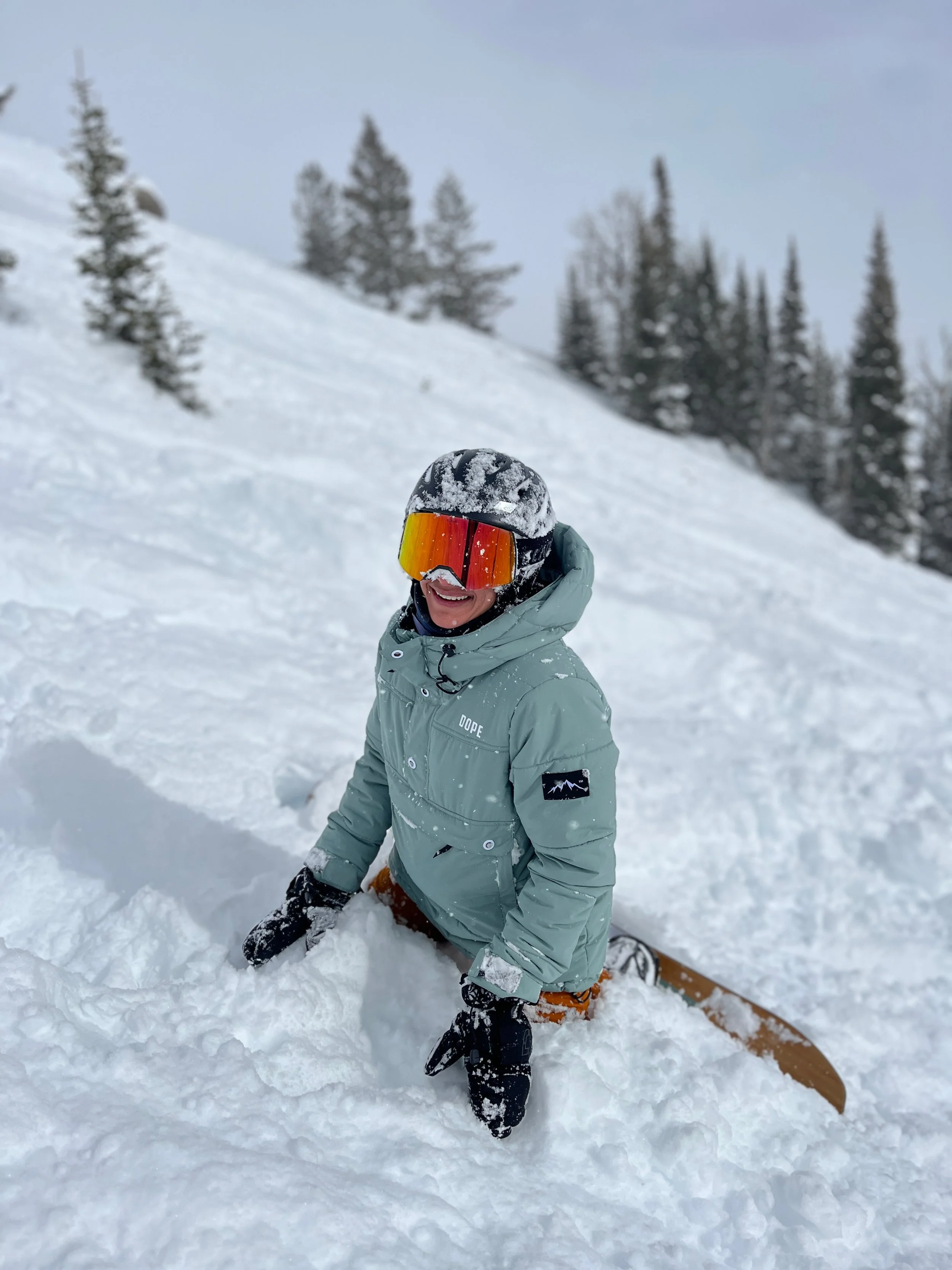
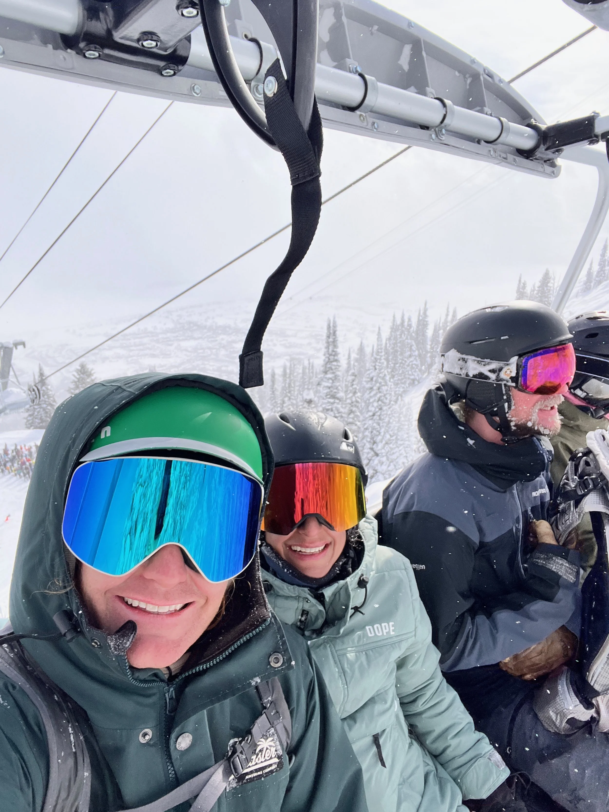
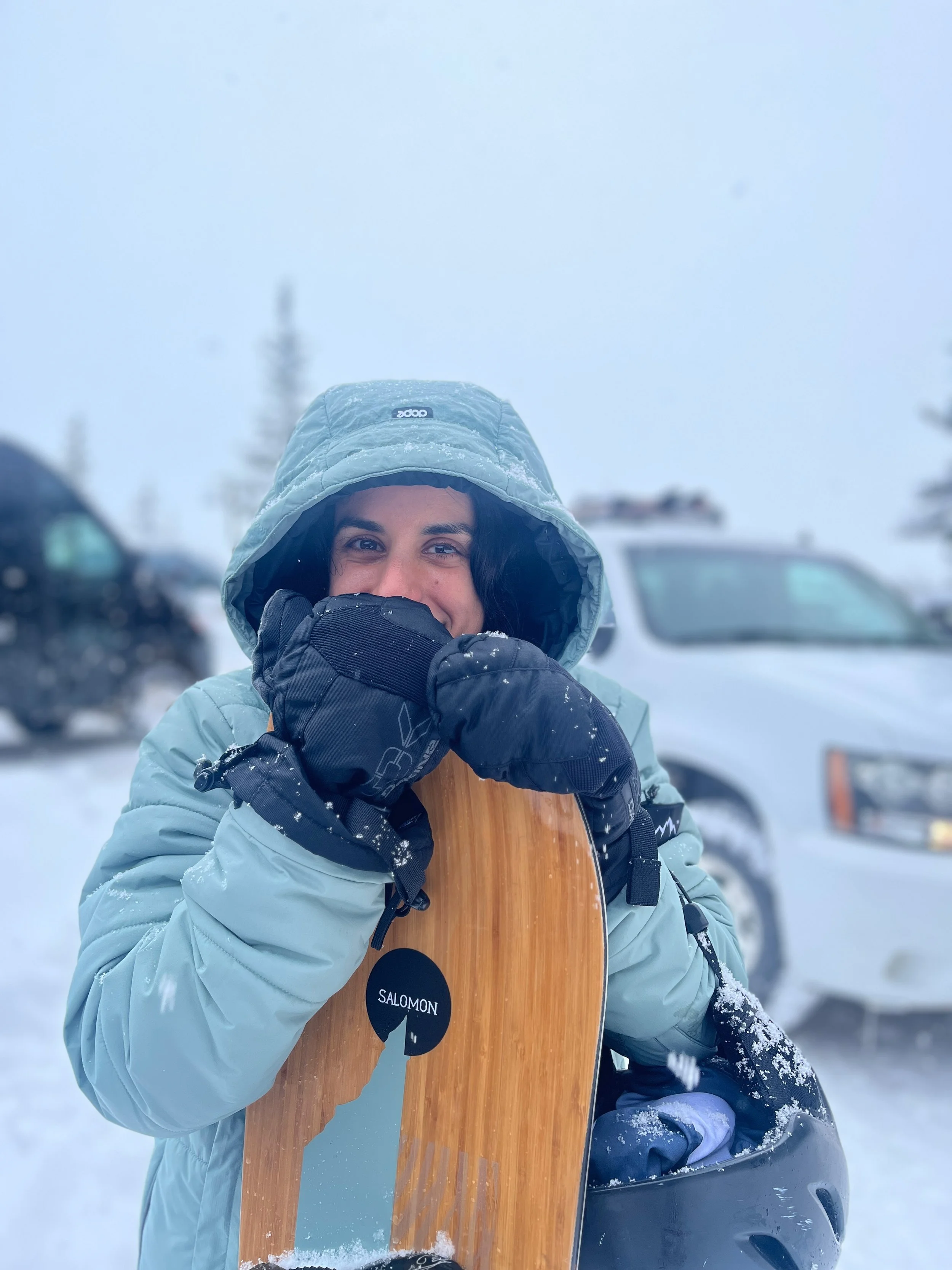
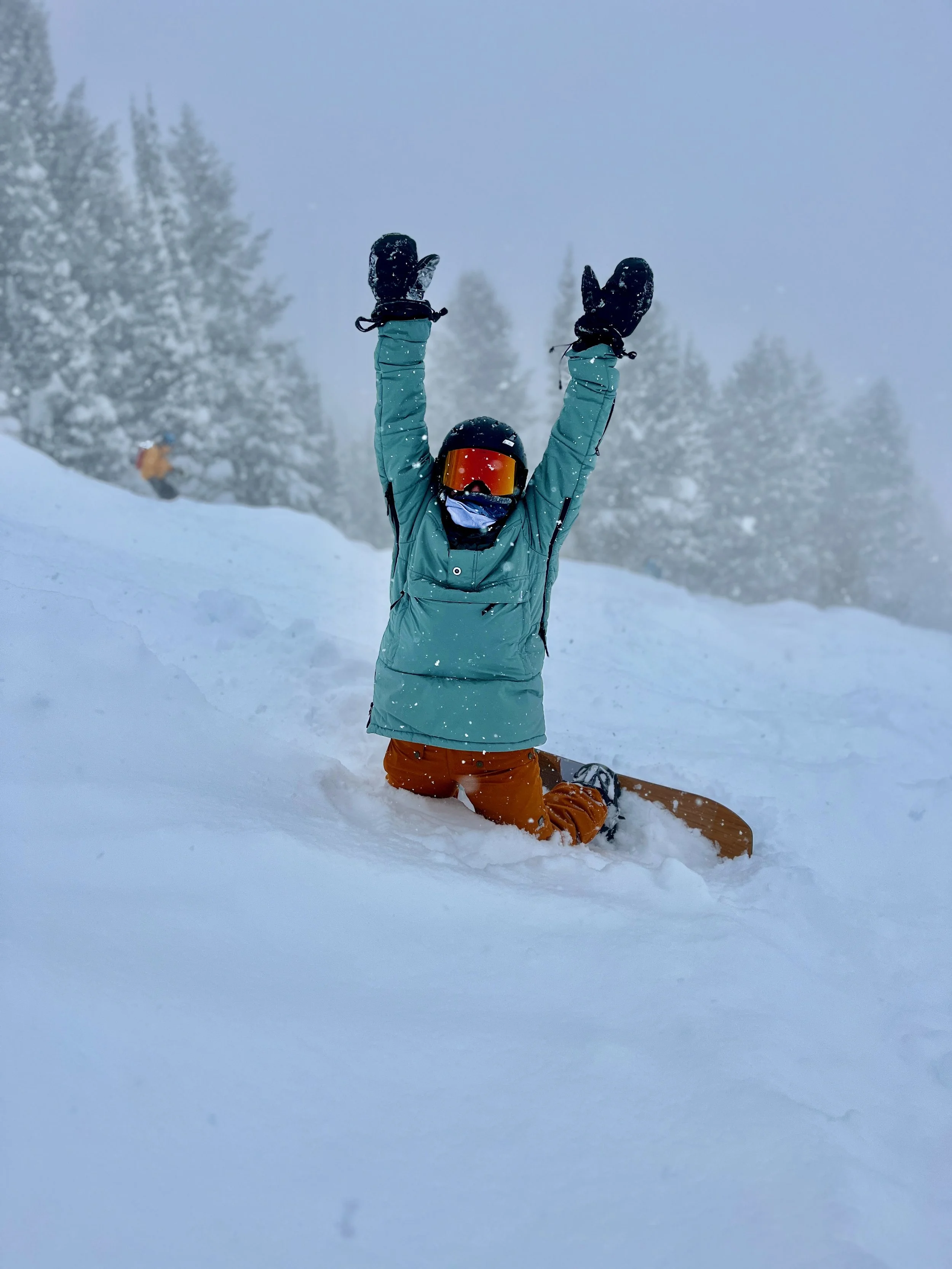
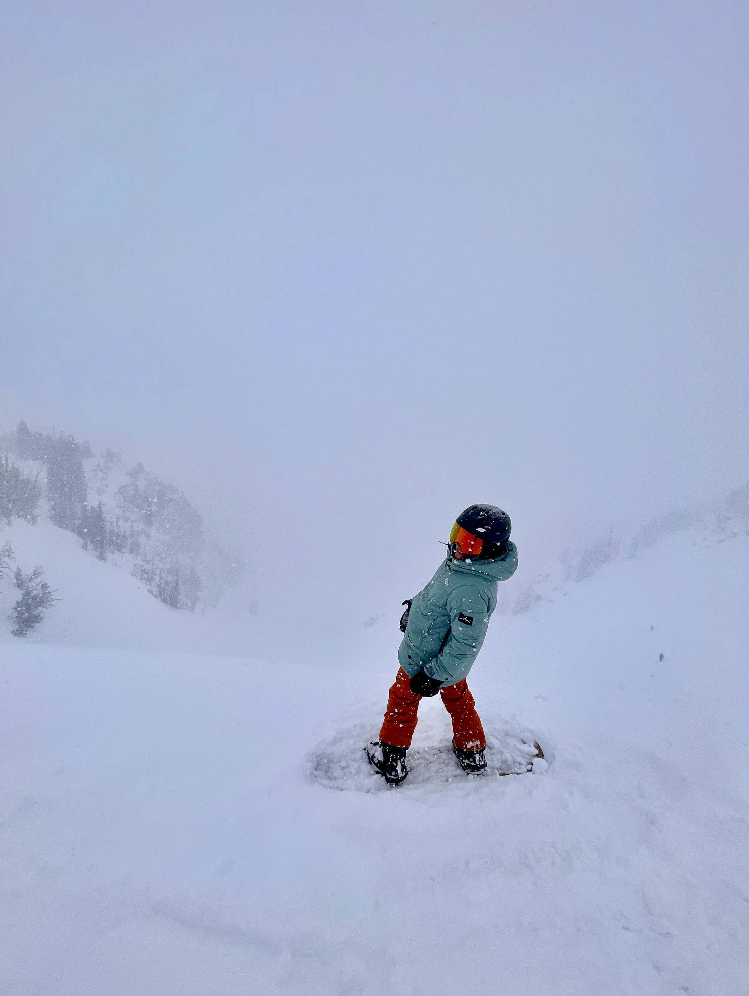
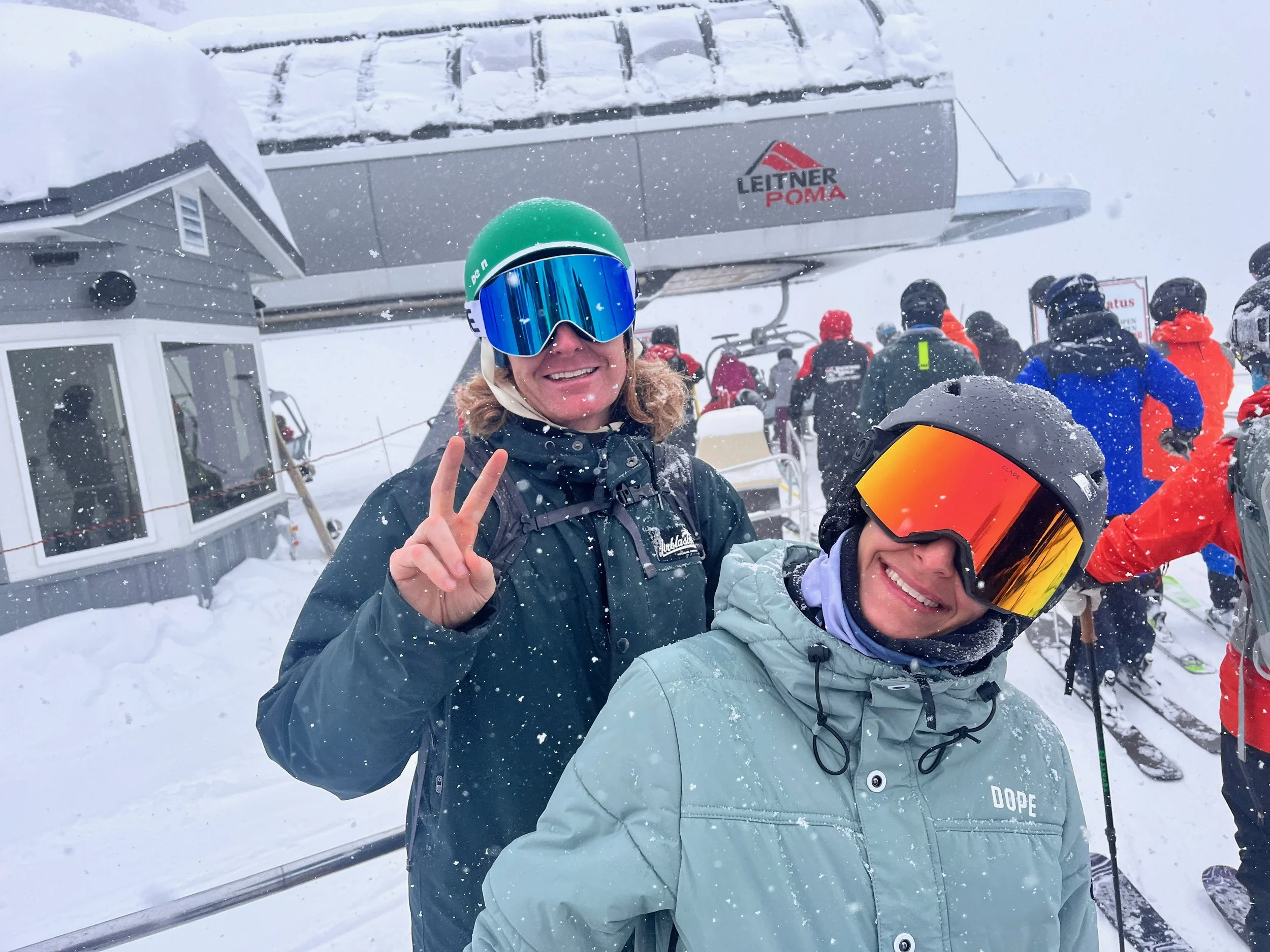
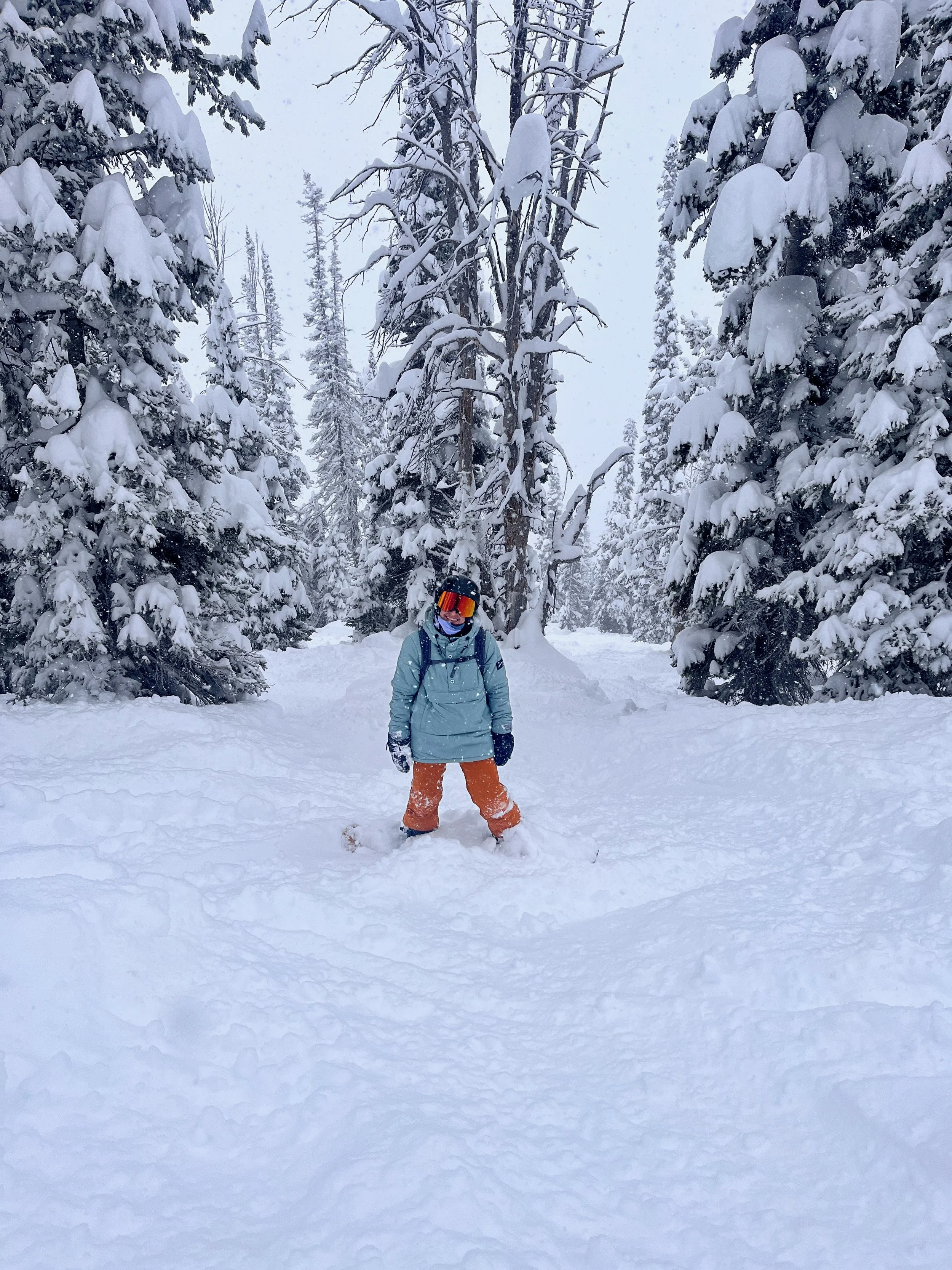
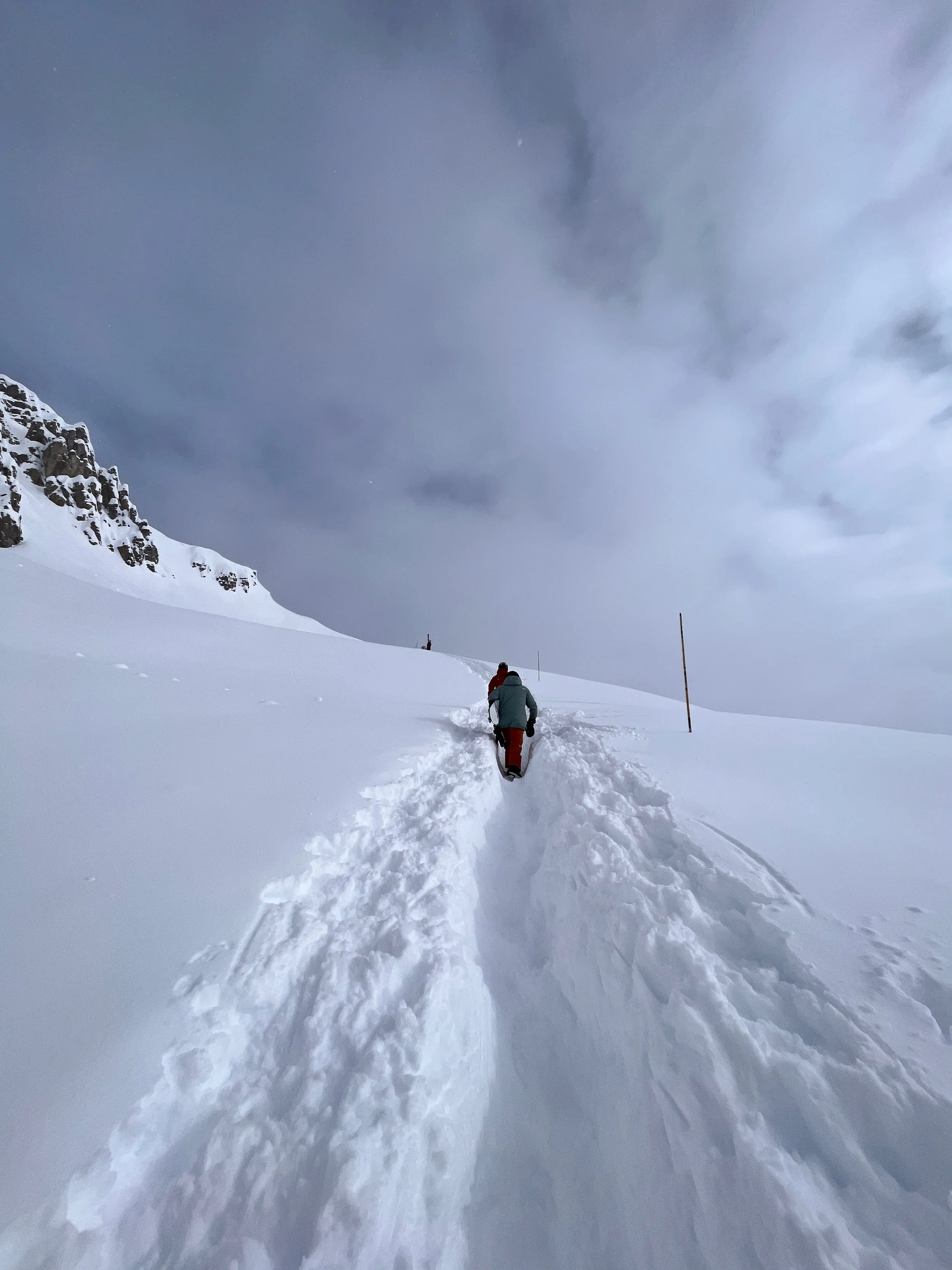
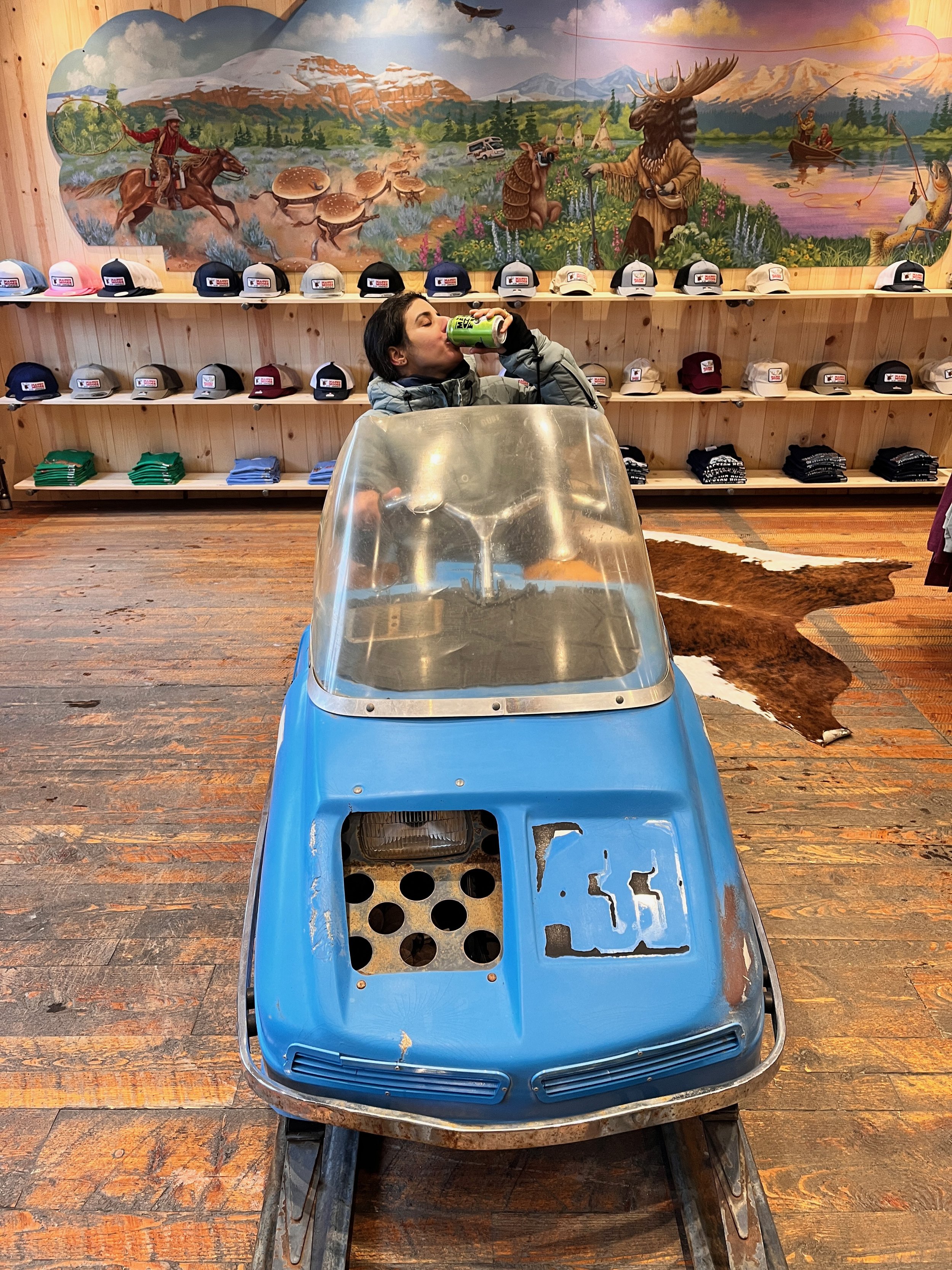
Shredding Jackson

Adding in some of my favorite photos and videos from a trip my wife and I made to Jackson Hole in mid February. It was my wife’s first time to Jackson - My 2nd. We got CRUSHED with fresh powder; 48” in the 2 days we were there. Absolutely one of the best snowboarding trips I’ve ever been on. Super proud of my wife as well.


Clinical Trial Software Design

Note: Like a lot of the work I did on healthcare software, I am not allowed to show very much! If you’d like to see where the company is now, you can go to their site here to see an expansion on foundation of work I did.
Overview
While I was at Lightmatter, I worked with Lokavant, a company that manages and tracks clinical drug trials, with a special focus on Serious Adverse Events (SAEs). The FDA defines SAEs as “An adverse event is any undesirable experience associated with the use of a medical product in a patient. The event is serious and should be reported to FDA when the patient outcome is death, hospitalization, disability, permanent damage, birth defects, [etc..].”
I was tasked with both designing and defining the user interface as well as conducting user research using clickable prototypes to gather feedback on the interfaces I had designed.
The Challenge
We were given an extremely short 8 week timeline to design an interface that both acted as a full-scale clinical study management tool as well as allowed users to report and manage detailed SAEs (dangerous side effects). Each section of the product required simple, but effective data visualization concepts to help users determine if any of the data was indicative of an SAE or if the data was simply an outlier.
User Testing
We conducted 8 weeks of product testing with 15+ clinical trial software experts. We guided our design through user-testing portals, where we shared clickable prototypes. With a testing protocol in hand, we had users perform tasks and gathered feedback. We iterated the interface based on their input, repeating the process until most users found it both easy to use and valuable for their work.
Data Visualization Examples
Often data visualization can be rather drab given the context, but I wanted to share a few pieces of the interface that I was able to create that I was fairly proud of, that users found very helpful, and that the engineering team wasn’t mad at either!
Outcome
I was able to provide the basic design infrastructure for the interface as well as deliver solid user-tested designs that are still being used today. I also got to meet some of the coolest people who do some of the most tedious detective work to discover serious health side effects within drug trials.
The work we did for Lokavant also won Lightmatter a year-long contract with one of their associated companies, of which you can read about the work I did on that here.
My Takeaway
Though we only had 8 weeks to complete the work we did, I’m super proud of my team for the work we were able to accomplish. Having even one solid team member to collaborate with helps so much in accomplishing huge tasks very quickly!
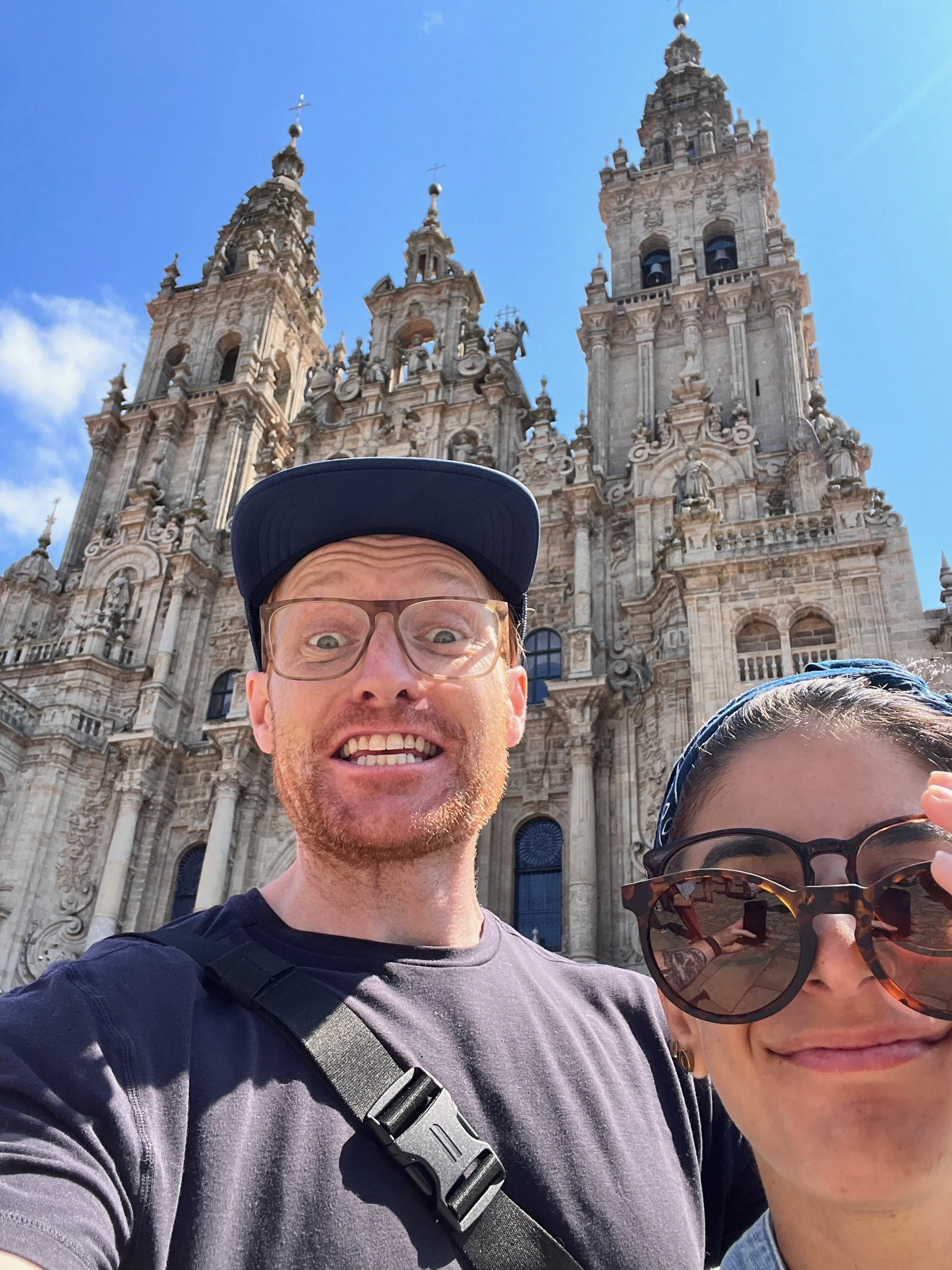
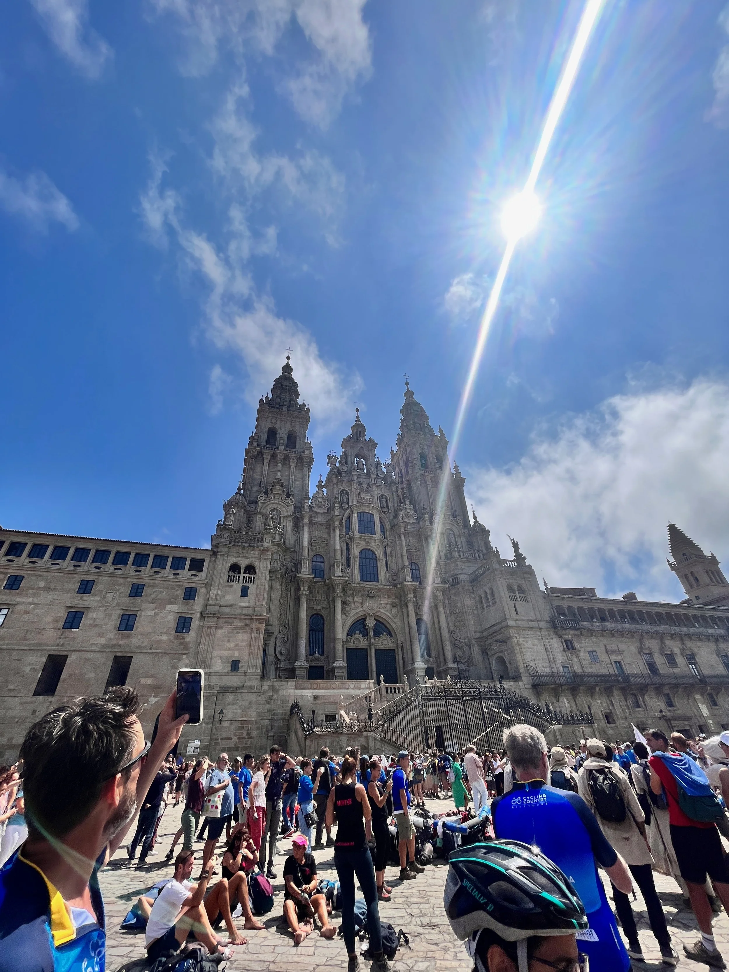
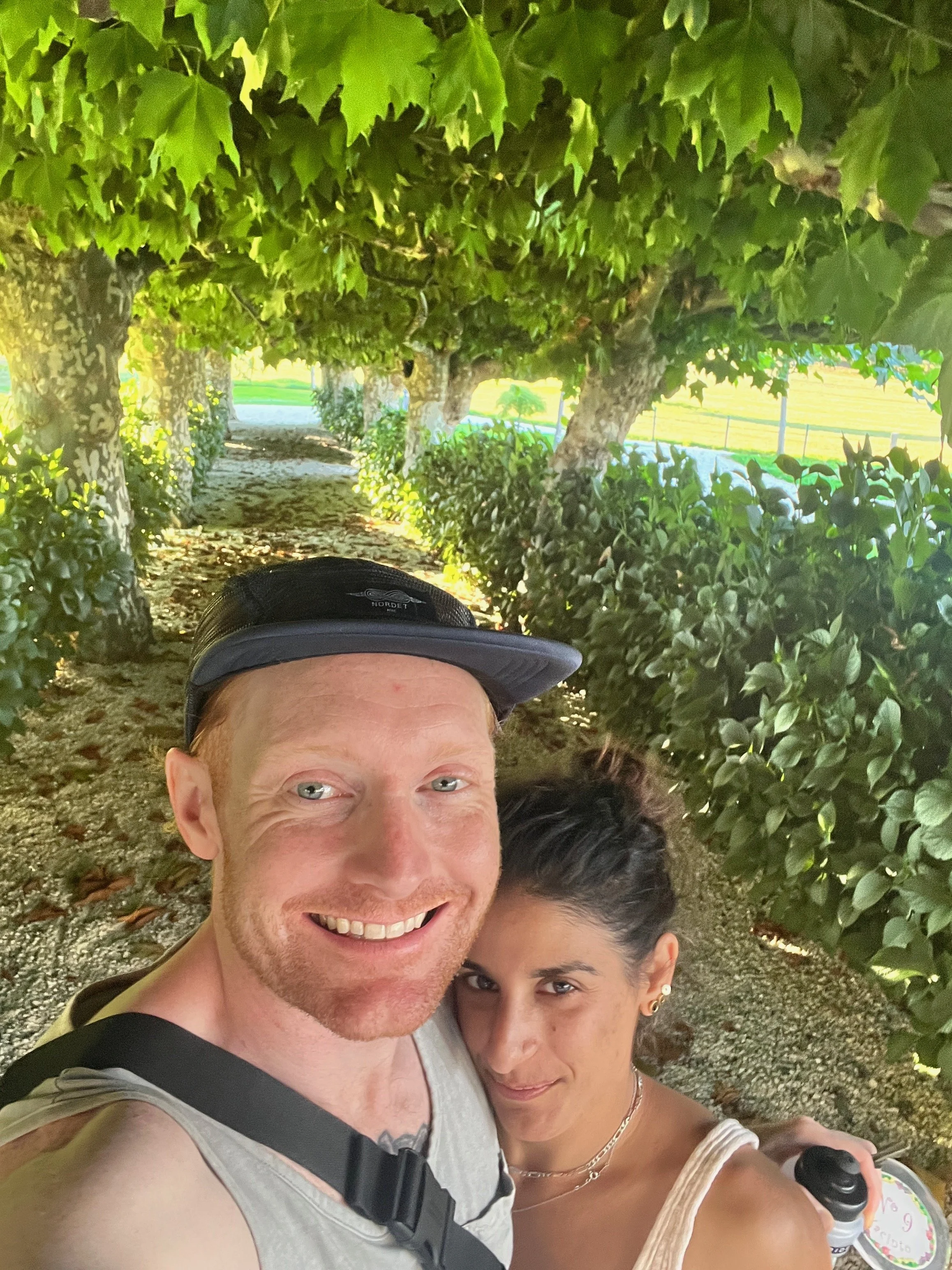
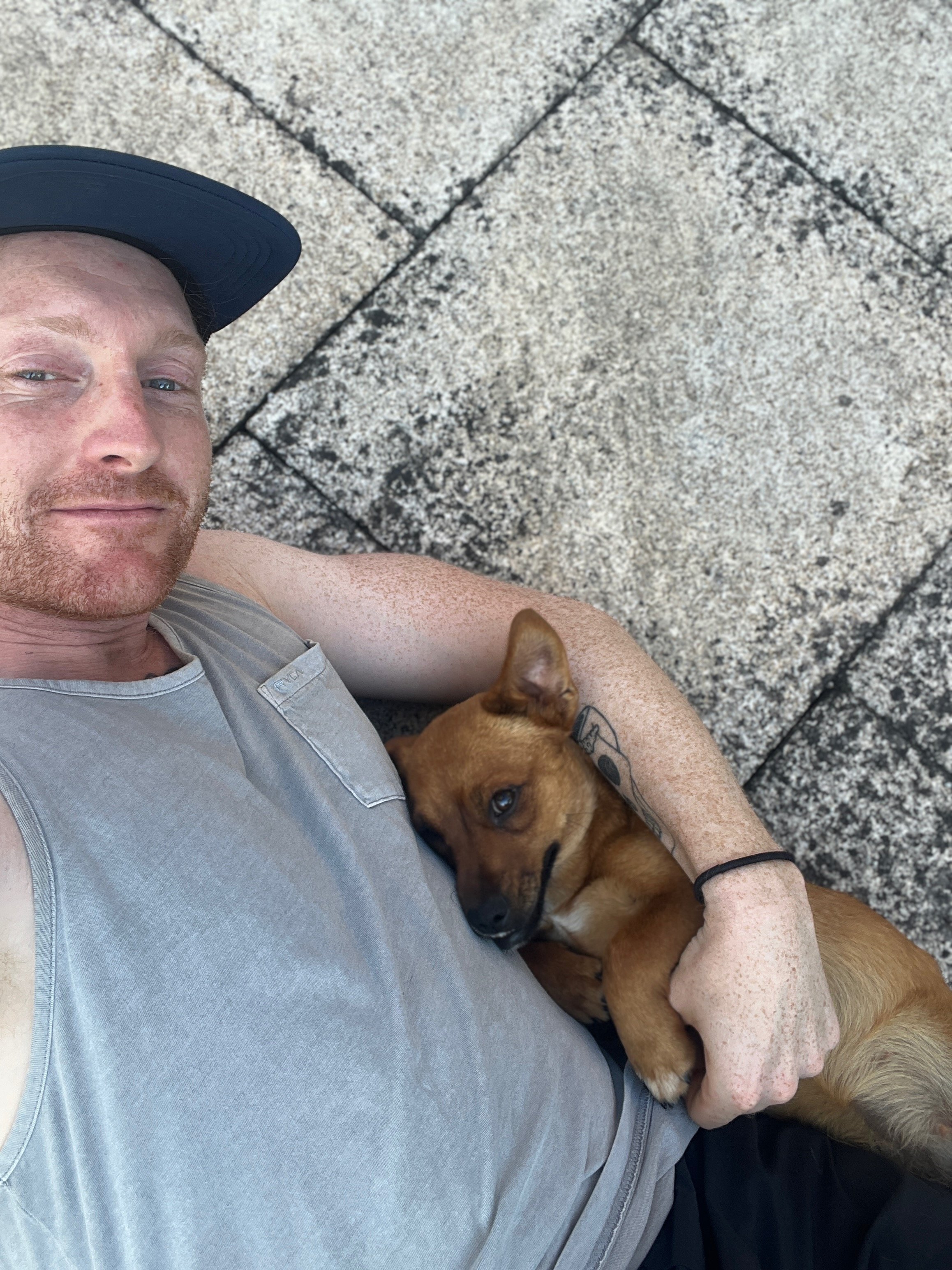
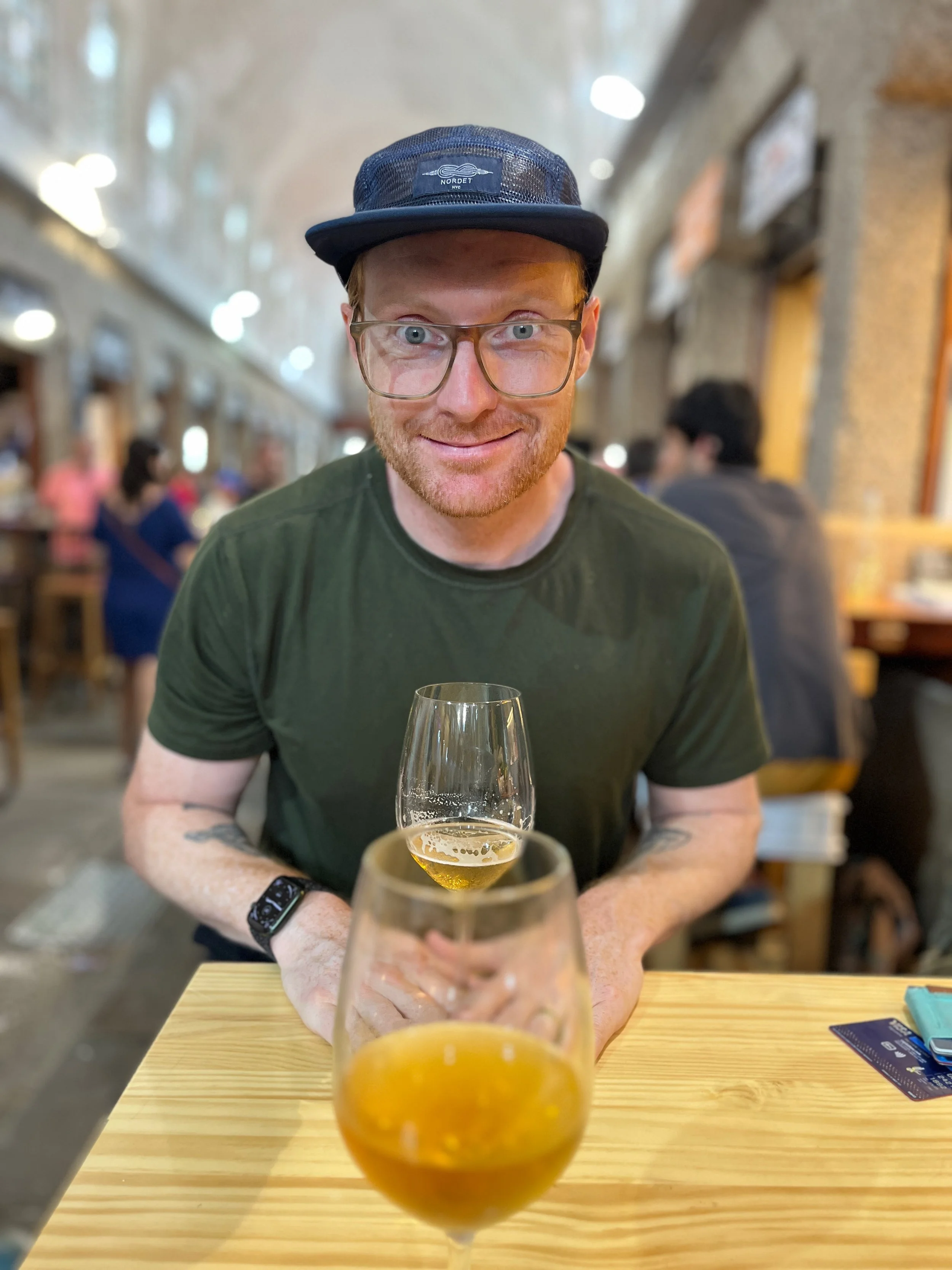
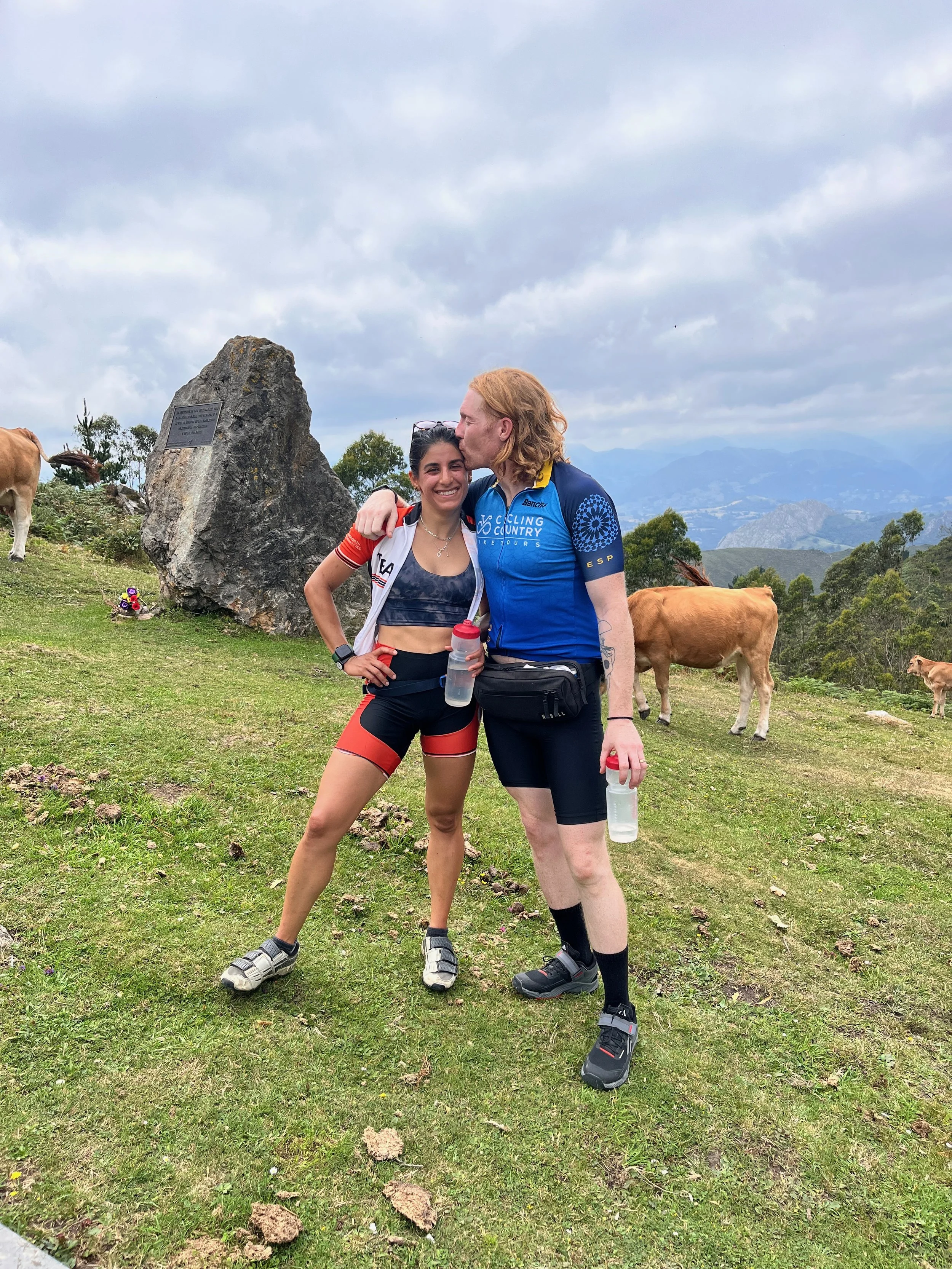
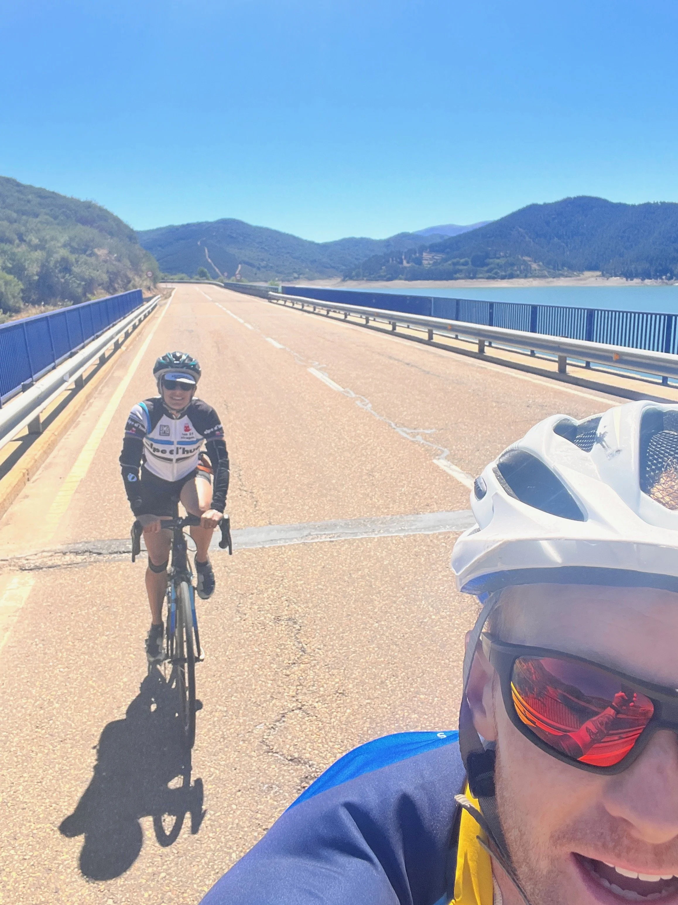
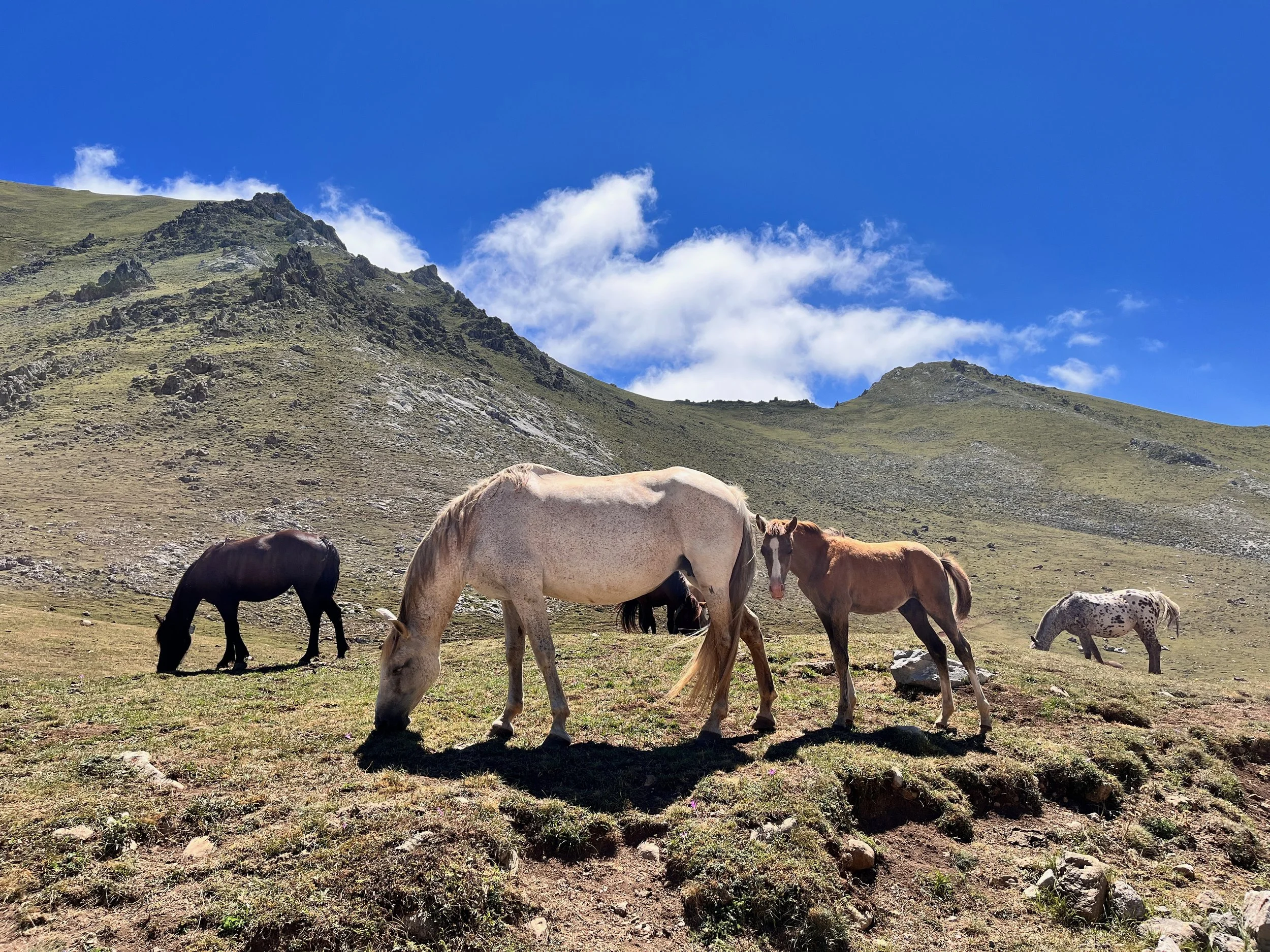
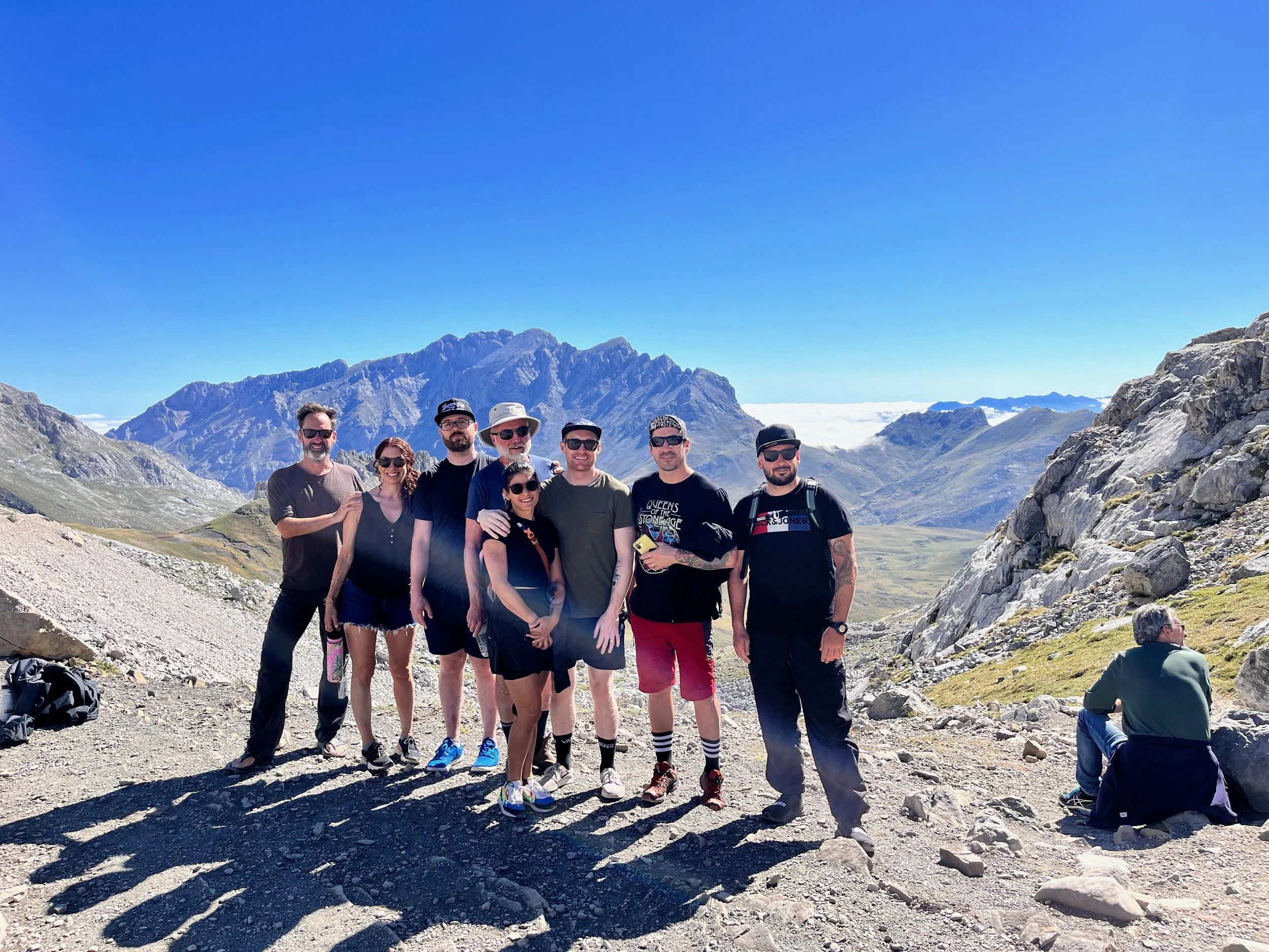
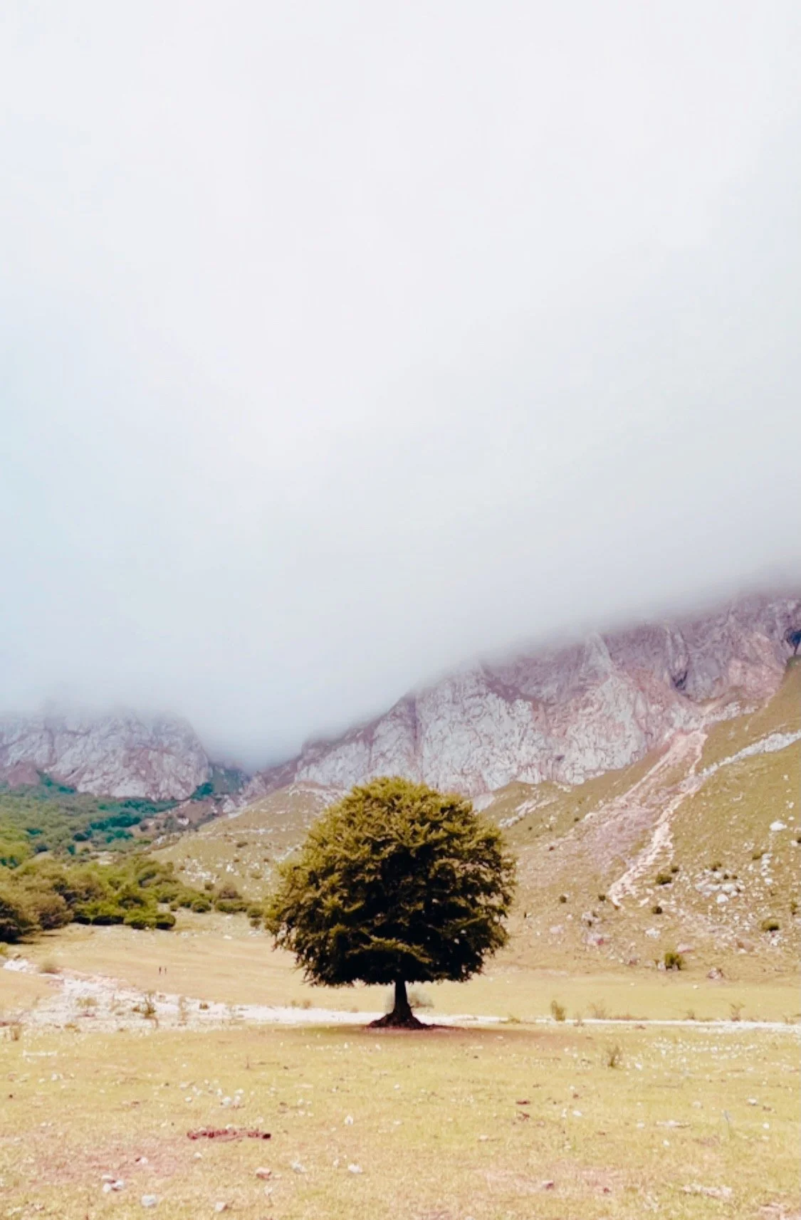
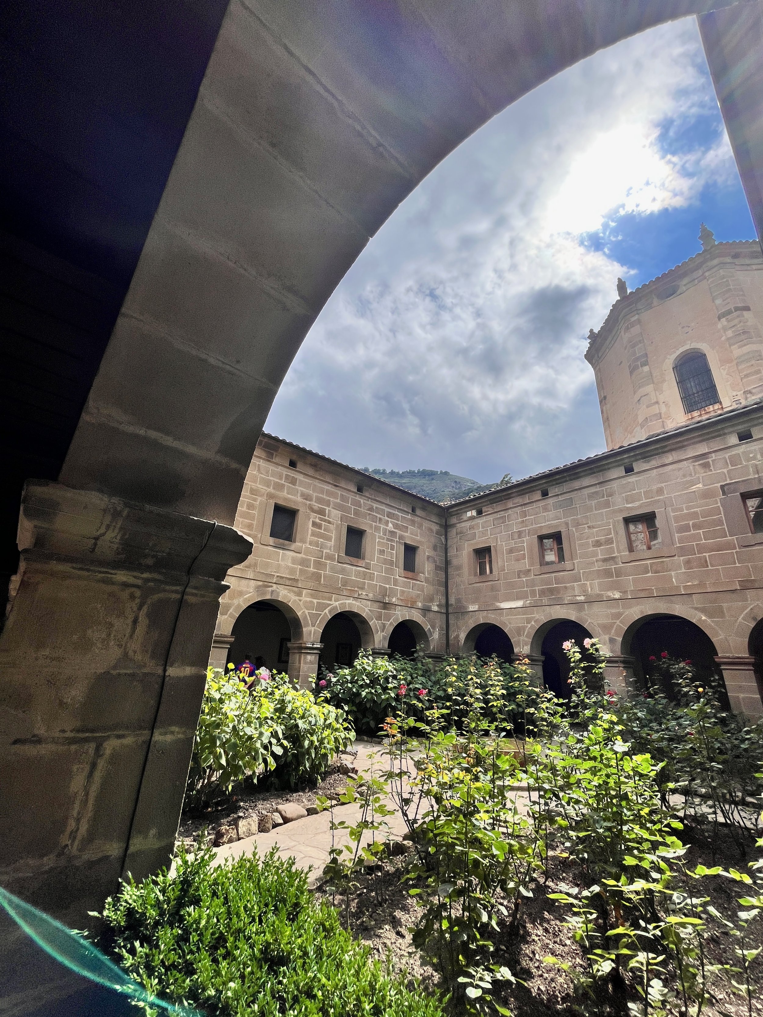
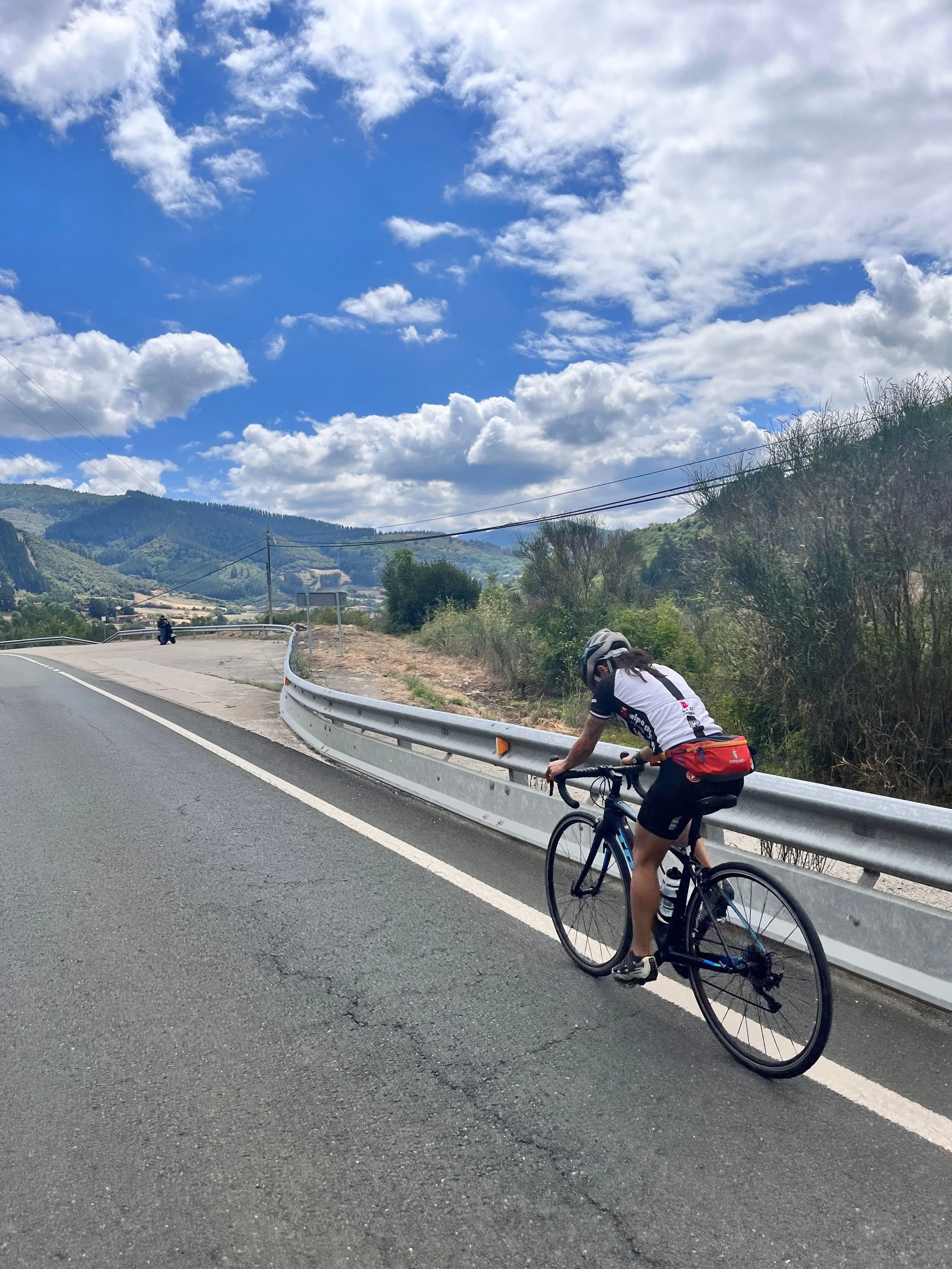
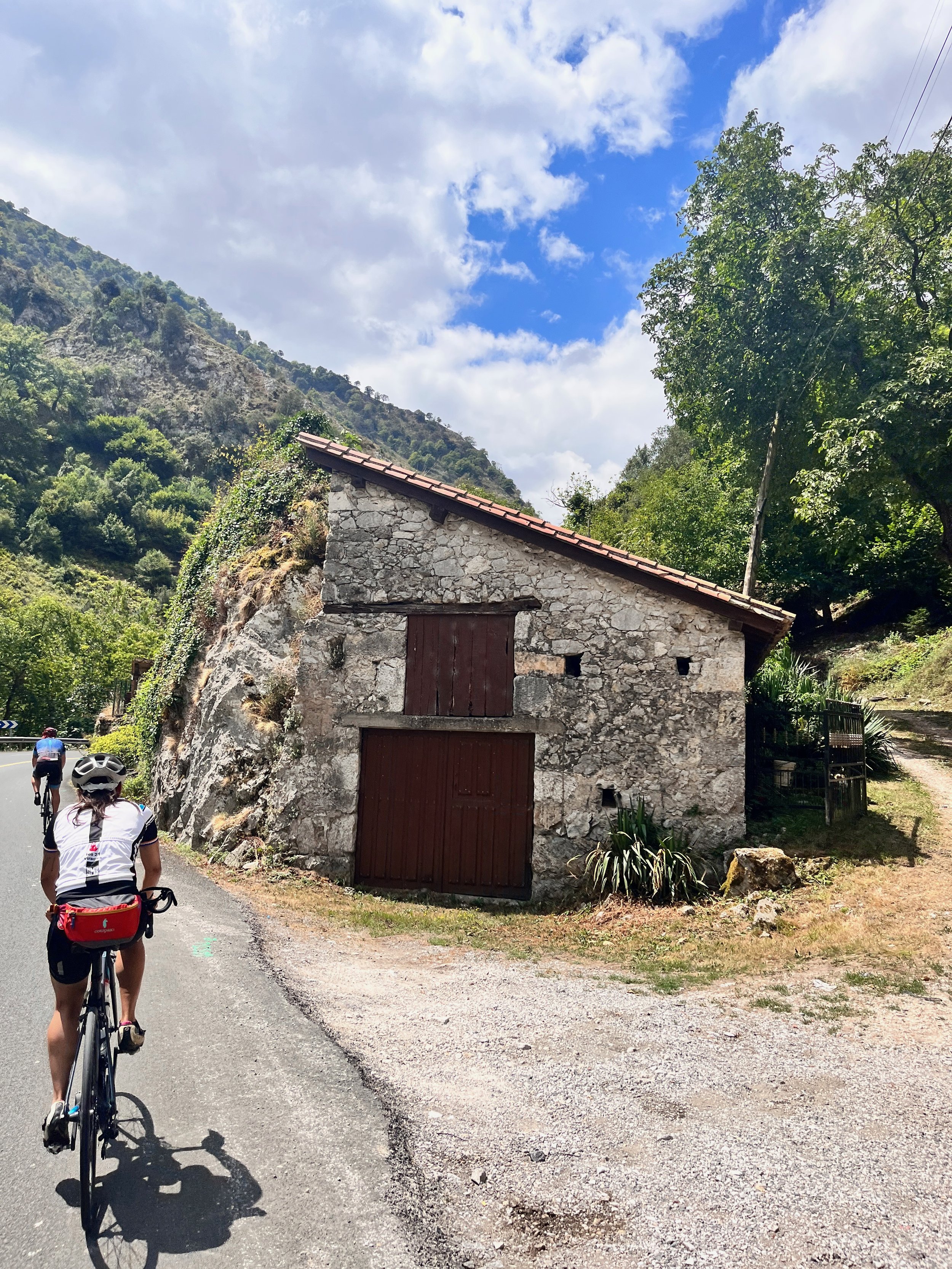
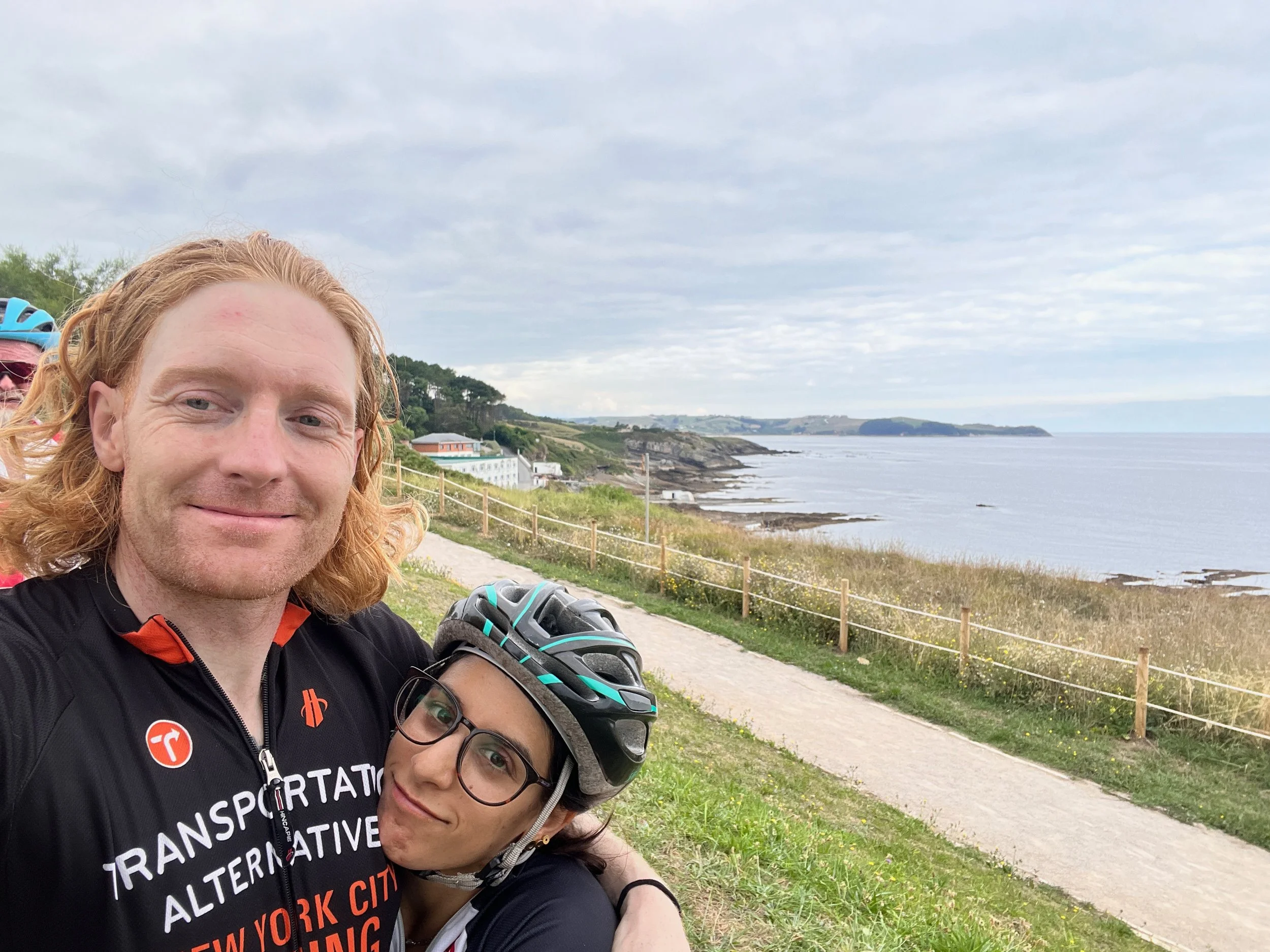
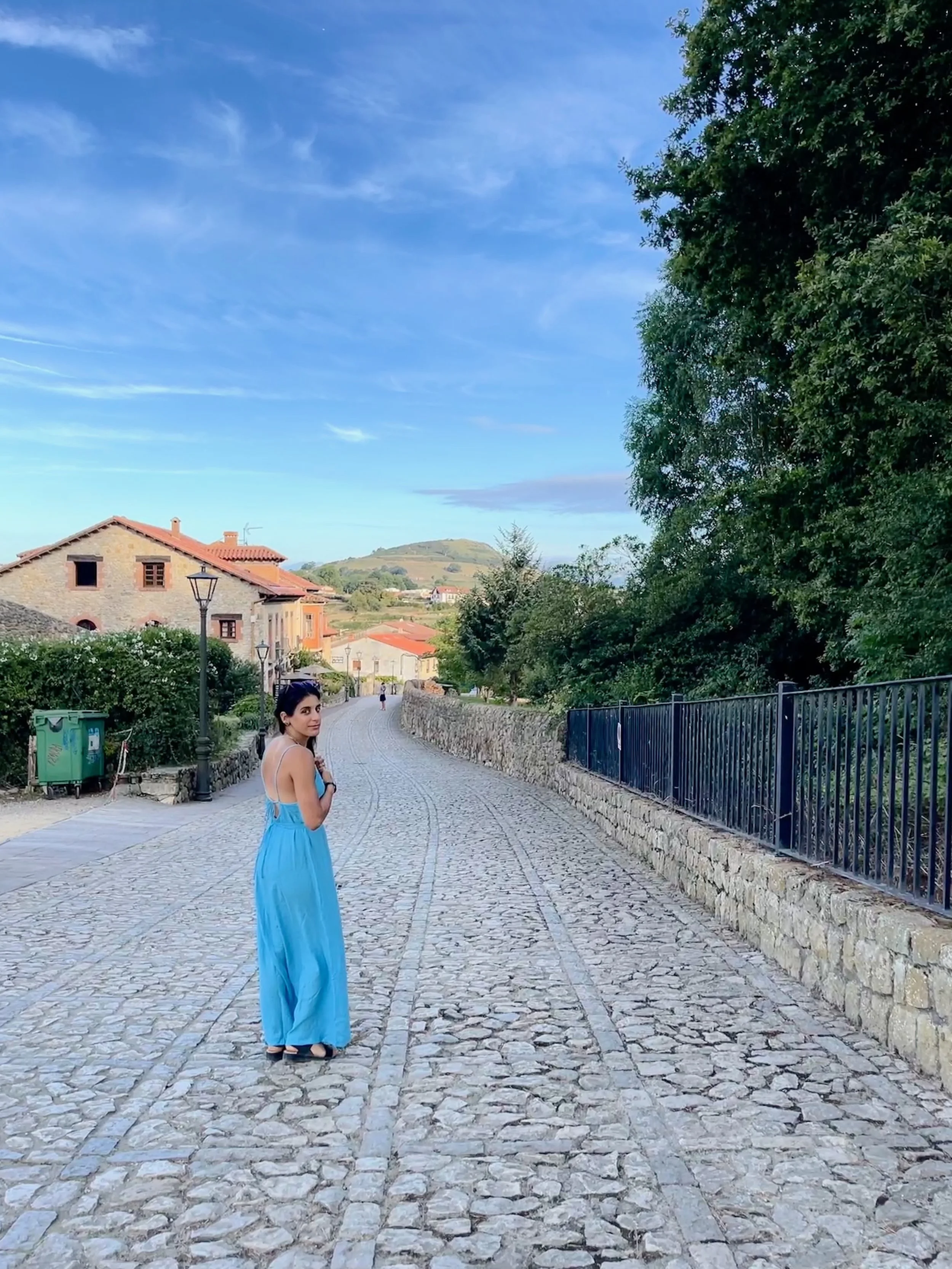
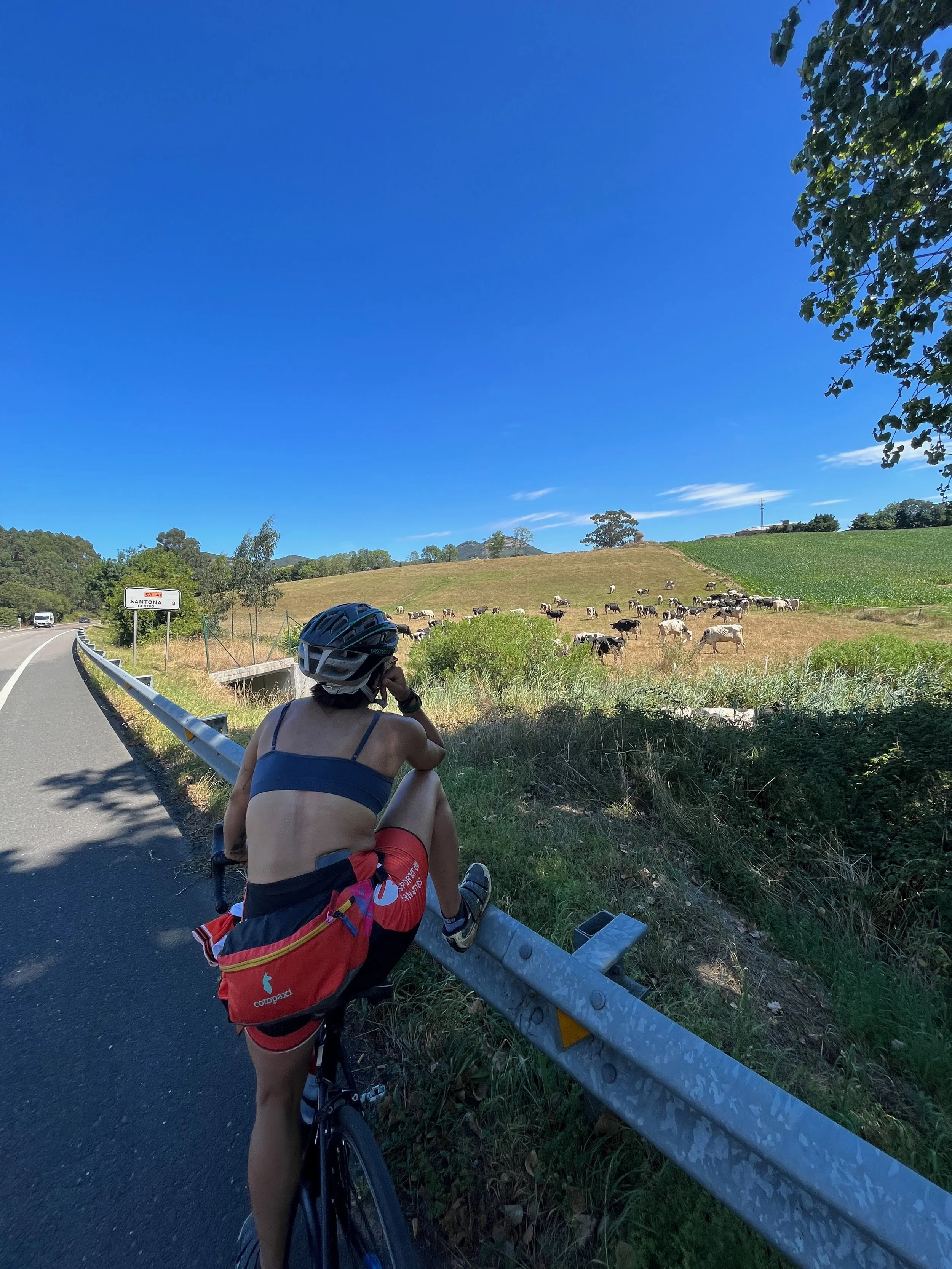
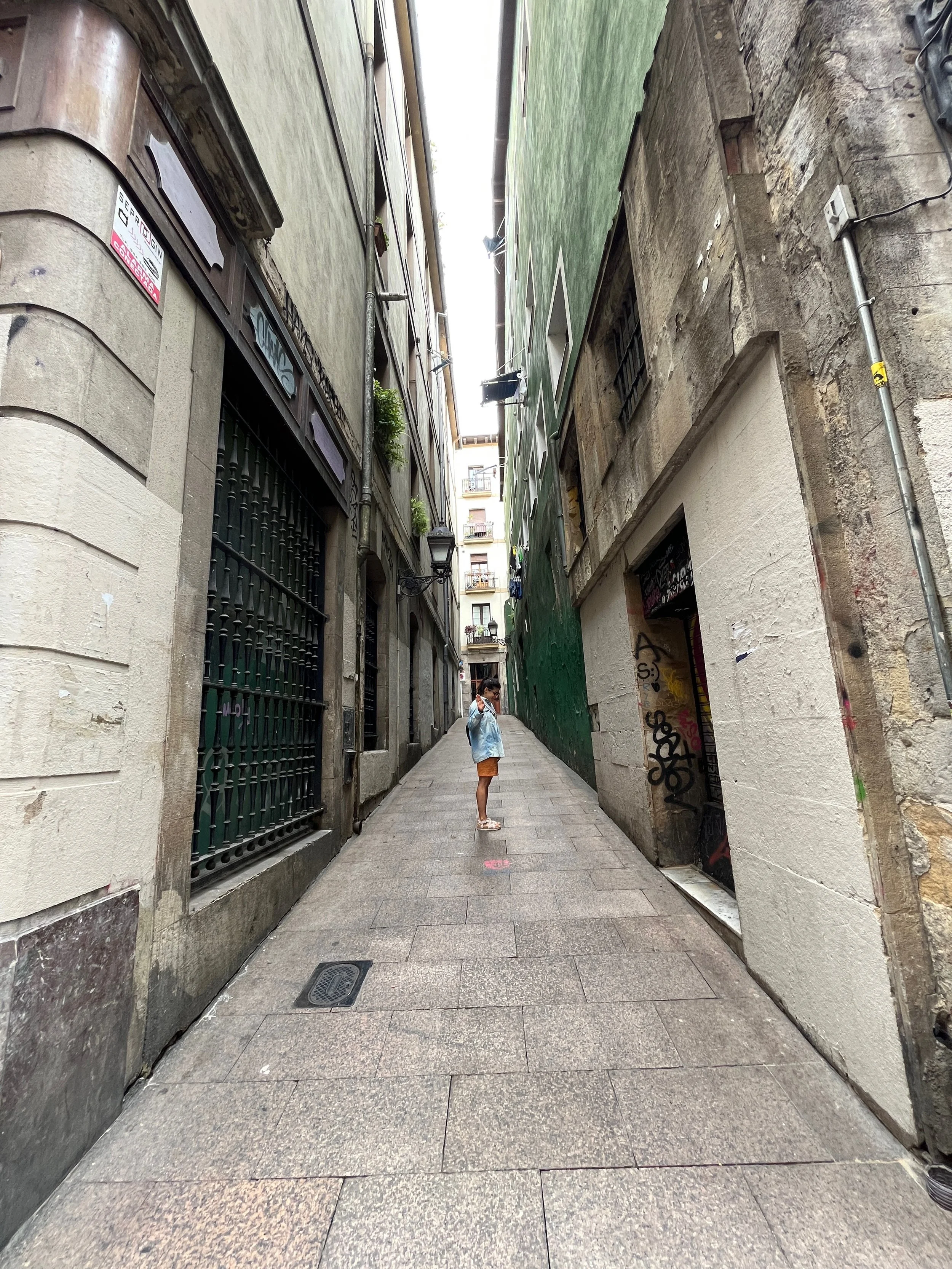
Biking El Camino De Santiago

My wife and I spent 10 days biking El Camino De Santiago, which is a very historical pilgrimage with multiple starting points that ends in a city called Santiago De Compostela. We started in Bilbao, Spain and made our way across the north coast of Spain, staying in historical locations along the way. We biked over 500 miles through some of the most gorgeous scenery (including huuuge mountain climbs).
Sharing some of my favorite photos from the trip below: